
How to Make a Slideshow on TikTok That Actually Gets Views
Learn how to make a slideshow on TikTok with proven strategies that boost engagement. Turn your photos into viral content that stops the scroll.
Why Everyone's Obsessed With TikTok Slideshows Right Now
 You've definitely seen them. Those swipeable photo stories that keep you glued to your screen, often for much longer than a typical video. TikTok slideshows have grown beyond a simple trend and are now a core part of how people consume content on the platform. The real appeal isn't just the pictures; it's the interactive experience that puts you, the viewer, in the driver's seat.
This format turns passive watching into an active journey. Instead of content just playing at you, you control the pace, swiping to reveal the next piece of the story.
The Psychology of the Swipe
Think about the difference between a video and a slideshow. A video moves at its own speed, but a slideshow needs your input. Every single swipe is a small choice you make, sparked by curiosity about what comes next. This simple action creates a much stronger bond with the content.
Imagine a creator doing a room makeover reveal. With each slide, they build anticipation and suspense, a feeling that's tough to get right in a quick video. This "what's next?" hook is a powerful psychological tool that keeps people engaged until the very end. For creators, this means higher completion rates, which tells the algorithm your content is worth showing to more people.
Capitalizing on a Growing Format
This move toward interactive content is a huge opportunity for anyone on the platform. With TikTok's user base soaring past 1 billion active users, the appetite for different kinds of content is bigger than ever.
Interestingly, while the average number of comments per post has climbed to around 19, shares have slightly decreased. This hints that content encouraging in-app actions, like swiping through a great slideshow, is becoming more important for engagement than just aiming for shares. For creators and brands, knowing how to make a slideshow on TikTok is no longer just a nice skill to have—it's a key strategy for standing out. You can learn more about TikTok's incredible growth in a 2025 report from The Social Shepherd.
Building Your Slideshow Creation Arsenal
Getting your slideshows to stand out on TikTok involves more than just hitting the right buttons inside the app. A smart workflow and the right tools are what really make the difference. While you can certainly create good content with just your phone, many of the top creators use a few key apps to give their slideshows that extra polish.
For example, Canva is a fantastic tool for creating visually consistent slides, and it's free to get started. Another go-to is CapCut, which is TikTok's sister app and offers more advanced editing features without a price tag. When you're ready to step up your game, apps like Adobe Express can provide even more creative power.
No matter which tool you choose, the technical details are what make your content look professional. Always aim for images with a 1080x1920 pixel resolution and a 9:16 aspect ratio. This ensures your content fills the entire screen on a mobile device and looks incredibly crisp, avoiding those dreaded black bars.
Workflow and Template Strategies
An efficient workflow is your secret weapon for creating content consistently without burning out. Many successful creators batch their content, which means they create multiple slideshows in one sitting. This usually involves organizing all your photos into dedicated folders beforehand, which saves a ton of time during the actual editing process.
Creating your own templates is another game-changer. You don't need fancy software for this. Just design a few core slide layouts that match your brand's style—think consistent fonts, a set color palette, and maybe your logo in the same spot on each slide. This simple step makes creating a TikTok slideshow much faster without letting the quality slip.
To help you choose the right app for your needs, here's a quick comparison of some popular tools for slideshow creation.
Essential Tools for TikTok Slideshow Creation
Comparison of popular apps and tools for creating TikTok slideshows, including features, pricing, and best use cases
| Tool Name | Best For | Price | Key Features | Ease of Use | | :--- | :--- | :--- |:---|:---| | TikTok (In-app) | Quick & simple slideshows | Free | Basic transitions, text overlays, trending sounds | Very High | | CapCut | Advanced editing & effects | Free | Multi-track editing, custom text animations, auto-captions | High | | Canva | Branded & graphic-heavy slides | Freemium | Huge template library, brand kits, photo editing tools | High | | Adobe Express | Professional-grade templates | Freemium | Integrated stock photos, advanced design tools, branding features | Medium |
Ultimately, the best tool is the one that fits your specific workflow and creative goals. Don't be afraid to experiment with a couple of them to see which one you feel most comfortable with.
The infographic below breaks down the simple but effective process for adding transitions between your slides, a key part of making them look smooth and professional.
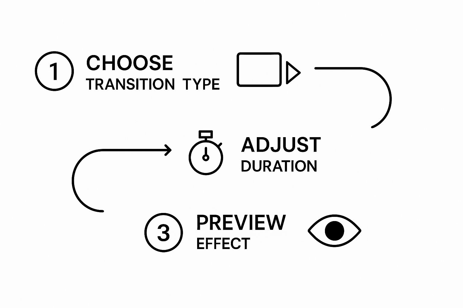
As you can see, a great transition is just a matter of selecting a style you like, setting its speed, and checking the result. It’s a straightforward loop that you can master quickly to give your slideshows that polished feel everyone is after.
Creating Your First Slideshow That Doesn't Suck

Jumping into the TikTok editor can feel simple enough, but the small decisions you make separate a boring photo dump from a story that gets people to watch until the end. It all begins when you tap the “+” icon, switch to "Photo" mode, and start picking your images. This isn't just about choosing your best pictures; it's about building a narrative.
The Art of Sequencing and Flow
The order you select your images in your gallery is exactly how they’ll appear in the slideshow. Think of yourself as the director of a mini-movie. A classic rookie mistake is revealing the best part first, like showing off a perfectly renovated room. Instead, build a little suspense.
Start with the messy "before" picture, show a few shots of the chaotic "during" phase, and then deliver the stunning "after" reveal. This simple chronological flow creates a satisfying story that keeps people invested and swiping. Another great trick is to create a curiosity gap. Use a text overlay on the first slide that says something like, "You won't believe what happened on my trip," and then sequence your photos to build up to the main event. For a deeper dive into the whole process, you might find our full guide on creating a TikTok slideshow helpful.
Enhancing with Text and Sound
Once your photo sequence is locked in, it's time to add some personality with text and sound. Each slide is a new chance to move your story forward with a quick text overlay.
- Be brief: People swipe fast, so aim for just a few impactful words per slide.
- Place it smartly: Position your text so it doesn’t block the most important part of your photo.
- Keep it consistent: Using the same font and color style gives your slideshow a clean, professional look.
Finally, the music is everything. Don't just slap on a trending sound. Find one that actually fits the vibe of your story. A funny, upbeat track can make a simple "day in my life" slideshow feel full of energy and fun. Tap “Add sound” at the top and test a few options while your slideshow plays. The right audio choice should support your story, not overpower it, turning your collection of photos into a complete, attention-grabbing package.
The Magic Number: Finding Your Perfect Slide Count
One of the most common missteps I see with TikTok slideshows is the slide count. Creators either cram in way too many photos, causing viewers to lose interest, or they cut the story too short, leaving people confused. The reality is there's no single "perfect" number that works every time. It's a balance between your story, your audience's attention span, and what the TikTok algorithm likes to see.
For example, a quick "Outfit of the Day" might only need 3 to 4 slides to get the point across. But if you're walking someone through a recipe or telling a detailed story, you might need closer to 8 or 10 slides to do it justice.
Quality Over Quantity: The Algorithm’s Preference
Think of every single swipe as a mini-test. Is this slide interesting enough to make the viewer want to see the next one? The TikTok algorithm watches this behavior closely. It rewards slideshows with high completion rates, meaning a lot of viewers swiped all the way to the end.
A short, punchy slideshow that everyone finishes is much more powerful than a long one that people give up on halfway through. This focus on viewer engagement is a core part of how the platform decides which content to push.
Recent analysis of TikTok’s carousel feature shows that posts with 3 to 10 slides generally get the best results. This range gives you enough room to build a narrative without feeling overwhelming. Always remember, a great 4-slide carousel will beat a bloated 8-slide one that causes viewers to drop off. Each slide has to earn the next swipe, which boosts your dwell time and signals to the algorithm that your content is valuable. You can find more details about the TikTok carousel algorithm at Usevisuals.com.
How to Test and Find Your Sweet Spot
So, how do you discover your own magic number? The best approach is to experiment and look at your data.
- Try different lengths: Post similar types of content but change the number of slides. Make a 4-slide version and a 7-slide version and compare which one gets a better completion rate.
- Check your drop-off point: Dive into your analytics and see where people stop swiping. If you notice a consistent drop after the fifth slide, that's a huge clue that you should tighten up your stories.
- Just ask: Use a poll or a Q&A sticker in your Stories to ask your followers what they prefer. Their direct feedback is priceless for making your content even better.
Design Principles That Make People Stop Scrolling
 A truly great TikTok slideshow is more than just a collection of nice photos; it’s about how you frame them to tell a story. You don't need a formal design background to make something that captures attention. Instead, by focusing on a few simple principles tailored for TikTok's fast-paced environment, you can make your content visually compelling and encourage viewers to watch until the end.
This all begins with a strong visual hierarchy. On every slide, one element needs to be the star. Is it the bold text hook at the top, or a specific detail in your image? Whatever it is, make it stand out. Use contrast to help with this—pairing a dark, bold font against a light, simple background makes your message instantly readable. Think of it as creating a clear focal point for your viewer's eye.
Typography and Color That Pop
Your choice of font can make or break a slideshow. I always recommend sticking to bold, clean sans-serif fonts because they are incredibly easy to read on a small screen, even in a split second. Avoid thin, overly decorative, or curly fonts, as they often become a blurry mess and viewers will just swipe away.
When it comes to color, go beyond just picking your favorites. Think about the feeling you want to create. A bright yellow can feel energetic and demanding of attention, while a cool blue can come across as more calming and trustworthy. Experiment with a simple, high-contrast color palette to keep your slideshows looking sharp and professional.
Layout and Spacing
The final piece of the design puzzle is your layout. Don't be afraid of white space, also known as negative space. When you cram every inch of the slide with text and graphics, it feels overwhelming and looks unprofessional. A little empty space around your main subject and text gives the design room to breathe and makes it appear far more polished.
To help you put these principles into practice, I've created a table that breaks down which design choices have the biggest impact on viewer engagement.
Design Elements That Boost Slideshow Engagement
Analysis of design choices and their impact on viewer engagement and completion rates
| Design Element | Impact on Engagement | Best Practices | Common Mistakes | | :--- | :--- | :--- | :--- | | High Contrast | Significantly increases text readability and view duration. | Use dark text on light backgrounds or vice versa. Pair bright colors with muted ones. | Using similar shades for text and background (e.g., light gray on white). | | Bold, Clean Fonts | Boosts retention by making information easy to scan quickly. | Stick to sans-serif fonts like Arial, Helvetica, or TikTok's built-in options. | Choosing thin, script, or overly decorative fonts that are hard to read on mobile. | | Strategic White Space | Improves focus on key elements, making the slide feel professional and uncluttered. | Leave ample margin around text and images. Isolate the main focal point. | Filling every corner of the slide, causing visual clutter and confusion. | | Consistent Branding | Builds brand recognition and trust over time. | Use a consistent color palette and font style across all your slideshows. | Changing styles with every post, which can confuse your audience. | | Logical Flow | Guides the viewer through a story, increasing completion rate. | Structure slides to show a progression (e.g., before/after, problem/solution). | Randomly ordering images with no clear narrative or connection. |
Ultimately, thinking about how each slide flows into the next is key. A simple "before-and-after" slideshow is so effective because its layout naturally guides the viewer. Mastering these basic elements is a core part of learning how to make a slideshow on TikTok that actually performs well and keeps people watching. For more inspiration on grabbing your audience's attention, you might find these social media hooks useful for visual storytelling.
Advanced Techniques From Top Creators
Once you have the basics down, it's time to learn the tricks that can take your slideshows from good to viral. The most successful creators on TikTok are expert storytellers, and they often use a powerful technique called a curiosity gap. This is the secret sauce that makes viewers need to know what's on the next slide.
Think about a travel creator who starts a slideshow with the text, "The one mistake that almost ruined our trip to Japan." This instantly creates a question in the viewer's mind that they have to see answered. This little trick turns someone from a passive scroller into an active participant, swiping all the way to the end for the reveal. It’s a simple but effective way to build a slideshow that keeps people hooked.
Seamless Editing and Smart Repurposing
Beyond just telling a good story, polished editing can make your content look much more professional. I'm not talking about flashy, over-the-top animations. Instead, focus on creating seamless visual transitions. For instance, if you're showing off a new outfit, try to keep your body in the same spot on the screen from one photo to the next. This continuity makes the swipe feel smooth and deliberate, not like a jumbled mess of random pictures.
Top creators also use interactive elements like polls and stickers right inside their slideshows to get people to engage. Placing a simple question or a sticker like this encourages direct interaction, which tells the TikTok algorithm that people are enjoying your content.
Finally, let's talk about content repurposing. You don't have to come up with a brand-new idea for every single post. A detailed slideshow on a "10-step skincare routine" can easily be broken down into five smaller, two-step "quick tip" slideshows. This strategy helps you get the most out of your best ideas, giving you more content to share without starting from scratch each time. It’s a smart way to work more efficiently while still providing great stuff for your audience.
Your Action Plan For Slideshow Success
So, you've got the theory down, but what's a plan without action? Let’s map out a practical way to turn what you've learned about making a TikTok slideshow into real, visible growth. This isn't about random posts; it's about building a smart, sustainable strategy that actually gets you somewhere.
Building a Realistic Posting Schedule
Consistency is king on TikTok, but don't fall into the trap of thinking you need to post three times a day to succeed. That's a direct path to burnout. Instead, take an honest look at your week and pick a schedule you can actually maintain. For most people, 3-5 high-quality slideshows per week is a solid, achievable goal.
My secret? I batch my content. I set aside a couple of hours on a Sunday to brainstorm, create, and edit everything for the week ahead. This simple trick crushes creative blocks and means I always have something polished and ready to post, even when life gets hectic.
Tracking Metrics That Truly Matter
It’s so easy to get fixated on view counts, but they don't tell the whole story. To figure out if your slideshows are truly connecting with people, you need to look at engagement quality. These are the metrics that give you real answers:
- Completion Rate: Are people actually swiping through to your very last slide? A high completion rate tells the algorithm your content is captivating and worth pushing to more people.
- Saves and Shares: These are gold. When someone saves your slideshow, it means they found it so useful or inspiring they want to come back to it. Shares mean it was good enough to pass on to a friend.
- Comments per View: This is a great indicator of how much your slideshow got people talking and thinking.
Overcoming Common Hurdles
Every creator hits a creative wall at some point. When it happens to you, don't panic. Go back and look at your best-performing slideshows. What was the hook? The format? The topic? You'll often find a winning formula hiding in your own analytics.
And when the algorithm inevitably shifts, stay focused on one thing: creating value for your audience. That's the one constant that will always work. For a deeper dive into building a content plan that can weather any change, our guide on developing a TikTok content strategy offers a great framework for long-term success.
Ready to put this plan into action? ViewPrinter can help you generate, edit, and schedule your slideshows more efficiently, freeing you up to focus on the creative ideas that will really drive your growth.