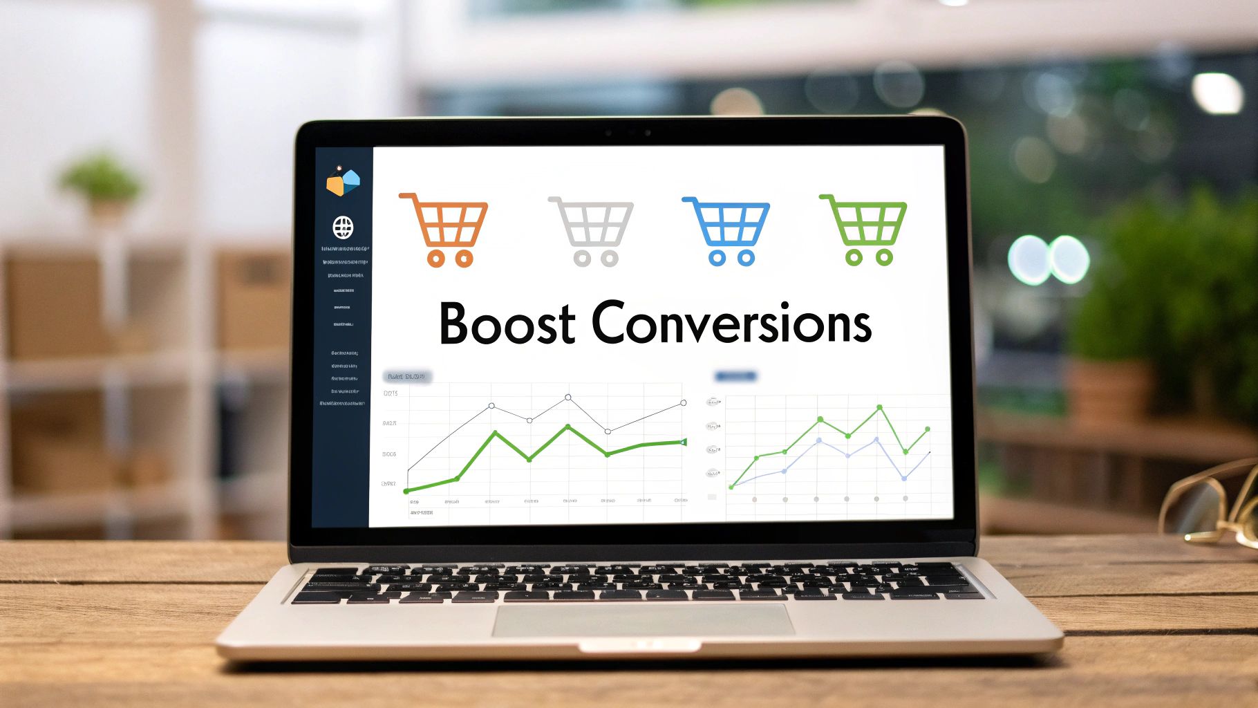
How to Increase Ecommerce Conversion Rate With 7 Proven Tactics
Discover how to increase ecommerce conversion rate with our guide. We cover proven CRO tactics for product pages, checkout, and A/B testing to boost sales.
Before you can boost your conversion rate, you have to play detective on your own site. This isn't about just glancing at your analytics; it's about digging deep to find the real bottlenecks—the confusing navigation, the slow-loading page, the clunky checkout form—that make people leave without buying. You need to pinpoint the exact friction points and build a solid, data-backed case before you change a single thing.
Diagnosing Your Conversion Bottlenecks

You can't fix what you don't understand. Just guessing at solutions—like randomly changing a button color or tweaking a headline—is a fast track to wasting time and money. The only way to uncover why sales are slipping through your fingers is with a systematic audit of the entire customer journey. It’s rarely one single, massive flaw; it’s usually a collection of small frustrations that add up and kill your conversion rate.
A great first step is getting a handle on why visitors aren't converting in the first place. For a solid overview on spotting and fixing these common issues, this guide on how to improve website conversion rates and stop losing customers is a fantastic resource. It’ll give you a framework for a much more effective audit.
Moving Beyond Standard Analytics
Tools like Google Analytics are great for showing you the "what"—like which pages have a high bounce rate or where you’re losing traffic in your funnel. But they can’t tell you the "why." To get the whole story, you have to pair that quantitative data with qualitative insights.
This is where behavioral analytics tools are a game-changer. They let you see your store through your customers' eyes, revealing all the subtle pain points that numbers alone will never show you.
- Heatmaps: These visual overlays show you exactly where people click, move their cursors, and how far they scroll down a page. A heatmap might reveal that everyone is clicking on an image that isn't a link, which tells you your design is creating false expectations. Or maybe it shows that 90% of visitors never scroll far enough to see your main call-to-action.
- Session Recordings: Think of this as a DVR for your website. You can watch anonymous recordings of real people using your site, seeing exactly where they hesitate, get confused, or run into a wall. Watching someone rage-click a broken button is a kind of undeniable feedback that a simple bounce rate number could never give you.
I’ve learned more about a site's usability problems from watching a dozen session recordings than I have from weeks of staring at spreadsheets. The "why" is in the behavior.
Segmenting Data to Find Hidden Patterns
Averages lie. Your overall 2% conversion rate might look okay, but it could be hiding a disaster. What if mobile users coming from Instagram ads are only converting at 0.5%, while desktop users from your email list are converting at a healthy 5%? The real insights are found when you start segmenting your data.
Start slicing your analytics to look for patterns:
- Device Type: Is there a huge performance gap between desktop, mobile, and tablet? A terrible mobile conversion rate is a classic sign of a poor responsive design or a checkout process that’s a nightmare on a small screen.
- Traffic Source: Are visitors from your paid search ads bouncing immediately? That’s a huge red flag that your ad copy is promising something your landing page isn't delivering.
- User Behavior: Compare the journey of people who buy with those who don't. What pages do converters visit that non-converters skip? How long do they spend on product pages?
Forming Data-Backed Hypotheses
Once you've gathered all this data, you can stop guessing and start forming clear, testable hypotheses. A good hypothesis doesn't just point out a problem; it proposes a specific solution and predicts a measurable outcome.
For example, instead of a vague observation like, "The product page is confusing," you'd form a data-backed hypothesis: "Based on session recordings that show users repeatedly trying to pinch-and-zoom on product images, we believe that adding a high-resolution zoom feature will increase add-to-cart rates by clarifying product details."
This structured approach turns your optimization work from a shot in the dark into a proper scientific process. It's the foundation for making changes that actually move the needle.
Turning Your Product Pages Into Persuasion Engines
Think of your product pages as the digital showroom where the final decision gets made. Someone who lands here is already interested; your job is to turn that curiosity into genuine confidence and desire. This is where you stop just listing features and start telling a story that makes them feel like this product was designed specifically for them.
Great product pages don't just show off what you're selling; they persuade. They anticipate questions, squash objections before they even form, and forge an emotional connection that makes hitting "Add to Cart" feel like the most obvious thing in the world. You’re building a case for why your product is the answer they’ve been looking for.
Write Descriptions That Sell Benefits, Not Just Features
One of the easiest traps to fall into is writing product descriptions that are just a dry list of specs. Yes, details like dimensions and materials matter, but they don't sell. Benefits do. A feature is what your product is; a benefit is what your product does for your customer.
The trick is to translate every single feature into a tangible benefit.
- Feature: "Made with waterproof ripstop nylon."
- Benefit: "Stay completely dry and confident on your hike, no matter what the weather throws at you. The durable fabric even resists tears, so your gear stays protected for years to come."
This simple shift helps customers picture how the product will actually improve their lives, which is an incredibly powerful motivator. For a deeper dive into this, check out our guide on how to write product descriptions that really connect.
People don't buy products; they buy better versions of themselves. Your copy should paint a clear picture of that transformation, however small it may be.
Create a Virtual Hands-On Experience With Visuals
Without a physical store, your product photography and videos have to do all the heavy lifting. Shoppers can't touch, feel, or try on your products, so your visuals must bridge that sensory gap. Investing in high-quality, professional imagery isn't a luxury—it's an absolute necessity for any brand serious about its conversion rate.
Generic stock photos or blurry, low-res images can kill trust in an instant. Your visuals need to be crisp, clear, and show everything.
Essential Visuals for High-Converting Product Pages:
- Multiple High-Resolution Images: Show your product from every possible angle. Don't forget close-ups to highlight texture, materials, and craftsmanship.
- In-Context or Lifestyle Shots: Help customers imagine themselves using the product. Selling a backpack? Show it on a person hiking, not just floating on a white background.
- 360-Degree Views: This interactive feature lets shoppers "spin" the product, giving them a much better feel for its shape and details from all sides.
- Product Videos: A short video showing the product in action is one of the most effective conversion tools out there. It can demonstrate features and answer questions far better than static text ever could.
Build Instant Trust With Social Proof
Here’s a simple truth: shoppers trust other shoppers far more than they trust brands. This is the psychology behind social proof, and it’s your most powerful weapon for building credibility. When a potential buyer sees that other people have bought and loved your product, it lowers their sense of risk and makes them feel much more secure about their decision.
Don't bury this stuff at the bottom of the page where no one will see it. Make it prominent.
Types of Social Proof to Feature Up High:
- Customer Reviews and Ratings: This is the absolute baseline. Displaying an average star rating right near the product title provides an immediate signal of trust.
- Testimonials with Photos: A glowing quote is good. A glowing quote next to a photo of a real customer? That’s exponentially more powerful. It adds a human face that builds a genuine connection.
- User-Generated Content (UGC): Encourage your customers to share photos or videos of them using your product on social media. Featuring this authentic content on your product pages is incredibly persuasive. It shows your product out in the wild, proving that real people aren't just buying it—they're happy enough to share it publicly. This is often the final nudge a hesitant buyer needs.
Creating a Frictionless Checkout Experience
Nothing kills a sale faster than a clunky, confusing, or surprisingly expensive checkout. This is the final hurdle, the moment a customer commits. Any friction here—an unexpected shipping fee, a mandatory account creation, or a slow-loading page—can send them running, leaving an abandoned cart in their wake.
The goal is to make paying for your products feel completely effortless and secure. Every field they fill out, every button they click, and every piece of information you request has to have a crystal-clear purpose. Think of it as guiding them down a well-lit path to a purchase they're already excited about.
Simplify and Streamline Every Step
Your customer is ready to buy; don't make them work for it. An overly complicated checkout is a huge reason why nearly 70% of online shopping carts get abandoned. The key is to mercilessly cut every non-essential field, question, and step from the process.
Here’s how to get started:
- Offer Guest Checkout Prominently: Forcing users to create an account is a massive conversion killer. Always provide a clear, easy-to-find guest checkout option. You can always invite them to create an account on the "thank you" page after the sale is complete.
- Use Progress Bars: A simple visual indicator showing customers where they are in the process (e.g., Shipping > Payment > Confirm) manages expectations and dials down any anxiety. It makes the whole thing feel finite and far less overwhelming.
- Enable Autofill and Address Lookups: Modern browsers can automatically fill in shipping and payment details, so make sure your forms are compatible. An address lookup tool that auto-populates the city and state from a zip code is another one of those small touches that makes a huge difference.
When a customer decides to buy, your job is to get out of their way. The best checkout experiences are the ones customers barely remember because they were so seamless.
Build Trust When It Matters Most
At checkout, customers are handing over their sensitive personal and financial information. This is where trust is non-negotiable. Any element that feels unprofessional or insecure can instantly trigger alarm bells and cause them to second-guess their purchase.
This is the perfect place to display trust signals that reassure them they're making a safe choice.
- Security Badges: Prominently display logos from trusted security providers like Norton, McAfee, or your SSL certificate provider.
- Payment Logos: Show the logos of the payment methods you accept (Visa, Mastercard, PayPal, Apple Pay). This visually confirms you accommodate their preferred way to pay.
- Clear Return Policies: A link to your return or money-back guarantee policy right at the checkout can be the final piece of reassurance a hesitant buyer needs.
Eliminate Surprise Costs
The number one reason for cart abandonment is unexpected costs. Period. A customer might be perfectly happy with a $50 product, but a surprise $12 shipping fee at the final step feels like a bait-and-switch.
Be upfront about all costs—including shipping, taxes, and any other fees—as early as you possibly can. A shipping calculator on the cart page is an excellent way to manage expectations long before they ever get to the final payment screen.
To give you a clearer picture, here are some high-impact changes you can make and what they can do for your conversion rates.
Key Checkout Optimizations and Their Impact on Conversions
| Optimization Tactic | Primary Goal | Potential Conversion Lift | | ----------------------------- | -------------------------------------------------- | ------------------------- | | Guest Checkout Option | Reduce friction and account creation hurdles | 10% - 30% | | Single-Page Checkout | Minimize steps and user effort | 5% - 20% | | Progress Indicator Bar | Manage expectations and reduce anxiety | 5% - 15% | | Mobile-First Design | Ensure a seamless experience on smaller screens | 10% - 25% | | Display Trust Seals | Build confidence and security | 2% - 10% | | Upfront Cost Transparency | Eliminate surprise fees and build trust | 15% - 40% | | Multiple Payment Options | Cater to user preferences (e.g., Apple Pay, PayPal) | 5% - 15% |
These aren't just minor tweaks; they're fundamental improvements that address the biggest reasons people leave. Implementing even a few of these can have a noticeable impact.
Visualizing your product page performance can highlight which elements customers engage with most before they even reach the checkout.
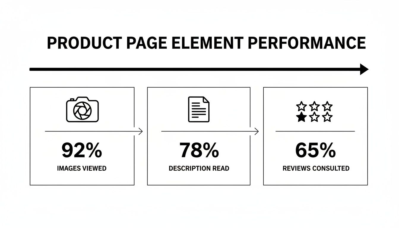
This data shows that while visuals grab the initial attention, customers still rely heavily on descriptions and reviews to build the confidence needed to actually proceed to checkout.
And don't forget the device your customer is using. Optimizing for desktop can dramatically boost your conversion rates, as desktops consistently outperform mobile. Industry benchmarks show the average conversion rate on desktop is 3.9%, compared to just 1.8% on mobile. This gap persists because desktop experiences often offer better product visualization and fewer distractions.
Many of these checkout optimizations, like abandoned cart reminders and personalized "thank you" pages, can be automated. For more ideas on this, check out our guide on ecommerce marketing automation.
Build Trust With User-Generated Content and AI

In a world overflowing with options, branded ads can quickly become white noise. Today's shoppers are sharp—and skeptical. They're looking for genuine proof that a product is actually worth their money.
This is where your existing customers become your most powerful marketing asset.
User-Generated Content (UGC)—real photos, videos, and reviews from actual customers—is the ultimate trust signal. It slices right through the skepticism in a way that polished marketing campaigns just can't. When a potential buyer sees someone just like them using and loving your product, it immediately validates their interest and makes the purchase feel less risky.
The numbers back this up. An analysis of over a thousand websites revealed that sites featuring UGC have a baseline conversion rate of 3.2%. That's already solid, but it gets better. When visitors actually interact with that content, conversions can double.
Turn Happy Customers Into Brand Advocates
So, how do you get this steady stream of authentic content? Most happy customers won't think to share photos or reviews on their own. You need to build a simple, rewarding system that nudges them in the right direction.
Here are a few ways to get the ball rolling:
- Time Your Ask Perfectly: Set up an automated email to go out a week or two after the customer receives their order. They’ve had time to use the product, but the initial excitement is still fresh. This is the sweet spot.
- Offer a Simple Incentive: A 10% discount on their next purchase in exchange for a review with a photo is often all it takes. This move not only gets you valuable UGC but also drives repeat business.
- Launch a Social Contest: Create a unique, branded hashtag and ask customers to share photos or videos of your product for a chance to win something cool. It's a great way to generate a wave of organic content and brand buzz.
- Make It Incredibly Easy: Your email should have a direct link that takes them straight to the review submission form. The fewer clicks, the better your chances.
Don't think of UGC as just another marketing task. It's about community building. When you showcase your customers, you’re telling them, "We see you, and we value you." That fosters a kind of loyalty that a single transaction can't buy.
If you're looking to build a system from the ground up, our guide offers a deep dive into creating a powerful user-generated content strategy that truly fits your brand.
Use AI to Amplify Your Best UGC
Collecting UGC is one thing; showcasing it effectively is another. This is where AI tools can completely change the game, turning a manual, time-sucking process into an efficient content machine.
Instead of manually sifting through hundreds of posts, AI can help you pinpoint your best-performing UGC by analyzing engagement and even visual quality. But the real magic happens when you start repurposing that authentic content. Platforms like ViewPrinter can take a glowing customer comment or a great product photo and instantly spin it into multiple social media-ready formats.
Picture this workflow:
- A customer posts a fantastic photo of your product on Instagram and tags your brand.
- An AI tool flags this high-quality UGC and pulls it into your media library.
- You then use an AI-powered studio to mix that image with a killer headline, a trending audio clip, and a clear call-to-action.
- In just a few minutes, you have a high-converting, authentic-looking video ad ready for TikTok and Instagram.
This creates an amazing feedback loop. You feature real customers, which builds trust and brings in new buyers. Those new customers then create more UGC, feeding your content engine and continuously lifting your conversion rates. You’ve turned one happy customer's post into a scalable sales machine.
Building Your A/B Testing Framework
So, you've done the deep dive into your site analytics and have a list of data-backed insights. That’s a fantastic start. But insights on their own don’t move the needle on revenue. The real magic happens when you stop guessing what might work and start proving it with a solid A/B testing framework.
This is how you turn those audit findings into repeatable, measurable wins that stack up over time.
A/B testing (or split testing) is just a controlled experiment. You pit two versions of a webpage against each other to see which one performs better. Version A is your control—the original page. Version B is the variation with the one change you’re testing. By showing these versions to different, random segments of your audience, you get a definitive answer on what drives a higher conversion rate.
This whole process takes ego and opinion completely out of the equation. It doesn’t matter what your design team thinks looks better. The only thing that matters is what your customers actually respond to with their clicks and their wallets.
From Insight to Hypothesis
Every great A/B test starts with a strong hypothesis. This isn’t just a random idea; it's a specific, testable statement built directly from the data you gathered during your audit. It needs to clearly state the change you’re proposing, the outcome you expect, and why you expect it.
A rock-solid hypothesis usually follows this simple formula: “If we [change X], then [outcome Y] will happen, because [reason Z].”
Let’s make this real.
- Vague Idea: “Maybe we should make the ‘Add to Cart’ button green.”
- Data-Backed Hypothesis: “Based on heatmap data showing users hesitate before clicking our gray ‘Add to Cart’ button, we believe that if we change the button color to a high-contrast green, then the add-to-cart rate will increase by 5%, because the new color will create a stronger visual cue and sense of urgency.”
See the difference? The second one is specific, measurable, and tied directly to observed user behavior. That kind of clarity is crucial for running tests that give you clean, actionable results.
Prioritizing Your Tests for Maximum Impact
You're probably sitting on dozens of testing ideas right now. Trying to run them all at once is a surefire way to create chaos and get muddy data. The smarter approach is to prioritize them based on their potential impact, your confidence in the idea, and how easy they are to implement.
A simple but effective way to do this is with the PIE framework:
- Potential: How much of an improvement can this test realistically deliver? Tweaking a headline on your checkout page has way more potential than changing the font color in your footer.
- Importance: How valuable is the traffic to this page? A test on a high-traffic product page is far more important than one on your "About Us" page.
- Ease: How much time and technical effort will this take? A simple text change is worlds easier than a full page redesign.
Score each test idea against these three factors to build a prioritized roadmap. This ensures you’re always dedicating your resources to the changes most likely to actually make you more money.
A classic rookie mistake is ending a test too early. A result might look amazing after two days, but you absolutely have to run the test long enough to reach statistical significance—usually a 95% confidence level—to be sure the outcome isn't just a fluke.
Common A/B Testing Mistakes to Avoid
Building a testing culture is as much about knowing what not to do. One wrong move can invalidate your results, leading you to make decisions that could actually hurt your ecommerce conversion rate.
Steer clear of these common pitfalls:
- Testing Too Many Things at Once: If you change the headline, button color, and product images all in one test, you’ll have no clue which change actually drove the result. Isolate one variable per test.
- Ignoring Statistical Significance: Don’t call a winner based on a tiny sample size or a gut feeling. Use an A/B testing calculator to know when your results are truly reliable.
- Forgetting External Factors: Did you run your test during a Black Friday sale or a major holiday? Big events can seriously skew your data. For the cleanest results, try to test during normal business periods.
By building a disciplined framework, you transform your optimization efforts from a series of hopeful stabs in the dark into a predictable engine for growth.
Common Questions About Ecommerce Conversion Rates
Jumping into conversion rate optimization can feel like opening a can of worms. It’s easy to get bogged down in benchmarks, A/B testing jargon, and a ton of conflicting advice. Let's clear the air and tackle some of the most frequent questions I hear from ecommerce owners.
Getting these fundamentals right is the first step to building a strategy that actually moves the needle for your store. There's no magic bullet, but there are definitely proven principles that work.
What Is a Good Ecommerce Conversion Rate to Aim For?
Everyone wants to know the magic number, but the truth is, it's all relative. While you'll see the global average float around 1.9-2.0%, a "good" rate really depends on your niche. A store selling unique arts and crafts might hit 4%, while a luxury watch brand might see 1.5% because people take a lot longer to decide on a big purchase.
A much better way to think about it is benchmarking against yourself. Your real goal should be steady, incremental improvement. Aim for a 10-15% lift quarter-over-quarter. If you're at 1.5% today, getting to 1.7% is a huge win. Once you cross that 3.2% mark, you can give yourself a pat on the back—you're officially in the top 20% of online stores.
Which Single Change Has the Biggest Impact on Conversions?
If I had to pick one, it would be the checkout process. Time and time again, this is where the biggest and fastest wins are found. Two tweaks, in particular, deliver an outsized punch:
- Slash Your Form Fields: Every single box someone has to fill out is another reason to leave. Do you really need their phone number right now? Cut everything that isn't absolutely essential.
- Offer Guest Checkout (and make it obvious): Forcing someone to create an account before they can give you money is one of the biggest conversion killers in the book. It’s a huge point of friction.
Both of these changes tackle the root causes of cart abandonment: friction and distrust. Once you've streamlined your checkout, the next highest-impact area is usually adding powerful social proof (like real customer photos and reviews) to your product pages.
The best conversion wins come from removing obstacles, not adding features. Simplify the path to purchase, and you’ll see immediate results.
How Does Website Speed Affect My Conversion Rate?
It's not just a small factor; it's a massive one. The data is crystal clear: even a one-second delay in your page load time can tank conversions by up to 7%. A slow site just feels clunky and untrustworthy.
Think about it from the user's perspective. They haven't even seen your amazing products yet, and the experience is already frustrating. This is especially true on mobile, where patience is practically zero. To see a real improvement in your conversion rate, focus on these three things first:
- Optimize Your Images: This is the #1 culprit. Huge, uncompressed photos will kill your load times.
- Use Browser Caching: This simple fix allows a visitor's browser to "remember" parts of your site so it loads almost instantly on their next visit.
- Get a Content Delivery Network (CDN): A CDN stores copies of your site on servers around the world, making sure it loads just as fast for a customer in London as it does for one in Los Angeles.
How Long Should I Run an A/B Test?
This is a classic question, and the answer isn't about a set number of days. It's about reaching statistical significance—which is just a fancy way of saying you're confident the results aren't due to random chance. The industry standard for that is a 95% confidence level.
How long that takes depends entirely on your traffic volume and how big of an impact your change makes.
As a general rule, you should let a test run for at least two full business cycles (so, two weeks for most stores). This helps smooth out any weird fluctuations from weekends or specific days of the week. Calling a test after just a few days, even if one version is way ahead, is a classic rookie mistake that can lead you to make the wrong call. For a deeper dive on this, check out this great guide on How to Improve Ecommerce Conversion Rates.
Ready to turn authentic customer content into high-converting social media posts automatically? ViewPrinter uses AI to help you create, schedule, and automate viral content in minutes, building trust and driving sales. Discover how our UGC ad studio can transform your marketing at https://viewprinter.tech.