Top 10 visual storytelling techniques for social media
Discover visual storytelling techniques to elevate your social media game with practical tips, examples, and templates that drive engagement.
In the crowded digital landscape of 2025, generic images and videos no longer cut it. The brands capturing attention and driving engagement are masters of narrative, using every pixel to tell a compelling story. This isn't about expensive equipment; it's about strategy. Understanding core visual storytelling techniques is the key to transforming forgettable content into memorable experiences that resonate with your audience and build lasting connections.
This guide breaks down 10 essential techniques used by professional filmmakers, designers, and viral marketers, providing actionable steps to apply them to your social media strategy today. We will explore how to evoke specific emotions with color, guide the viewer's eye with composition, and build suspense through precise editing. These skills are crucial for creating content that not only stops the scroll but also converts. While this article focuses on broad techniques applicable to any industry, those in specialized fields can find focused advice elsewhere. For example, to delve deeper into the overall strategies for utilizing visuals effectively in ministry, consider this practical guide on mastering church visual media.
By the end of this list, you'll have a complete toolkit to elevate your visual content from simple posts to powerful, persuasive narratives.
1. Color Psychology and Emotional Palettes
Color is far more than an aesthetic choice; it's a powerful psychological tool that directly influences audience perception and emotional response. This visual storytelling technique involves selecting a specific color palette to intentionally evoke feelings, guide attention, and reinforce your narrative's core message. By understanding that warm colors like red and orange often ignite feelings of energy and passion, while cool colors like blue and green can foster calm and trust, you can build an immediate, subconscious connection with your viewers.

The intensity of your chosen colors also plays a critical role. A highly saturated palette can convey vibrancy and excitement, ideal for a product launch or a high-energy brand. Conversely, a desaturated, muted palette can create a sense of nostalgia, seriousness, or melancholy, fitting for a more reflective or somber story.
How to Implement This Technique
- Define Your Narrative's Core Emotion: Before choosing colors, identify the primary feeling you want your audience to experience. Is it excitement, trust, urgency, or comfort? Let this answer guide your palette selection.
- Create a Consistent Emotional Palette: Develop a primary and secondary color palette and apply it consistently across all your visual content, from social media posts to website banners. This builds brand recognition and reinforces the emotional tone.
- Use Color for Emphasis: Employ a single, contrasting accent color to draw the viewer's eye to a key element, like a call-to-action button or a crucial piece of information in an infographic.
- Consider Accessibility: Ensure your color choices provide sufficient contrast for readability, especially for text overlays. Tools like Adobe Color's accessibility checker can help you meet WCAG standards.
For instance, a health and wellness app might use a palette of soft greens and blues to communicate tranquility and health. In contrast, a fast-food brand’s social media feed might leverage bold reds and yellows to stimulate appetite and create a sense of urgency. Ultimately, mastering color is one of the most effective visual storytelling techniques for shaping your audience's emotional journey.
2. Composition and Rule of Thirds
Composition is the deliberate arrangement of elements within your frame to guide the viewer's eye and tell a story. One of the most foundational visual storytelling techniques is the Rule of Thirds, which involves dividing an image into nine equal parts with two horizontal and two vertical lines. Placing key subjects along these lines or at their intersections creates a more dynamic, balanced, and engaging visual, preventing the static feel of a perfectly centered subject.
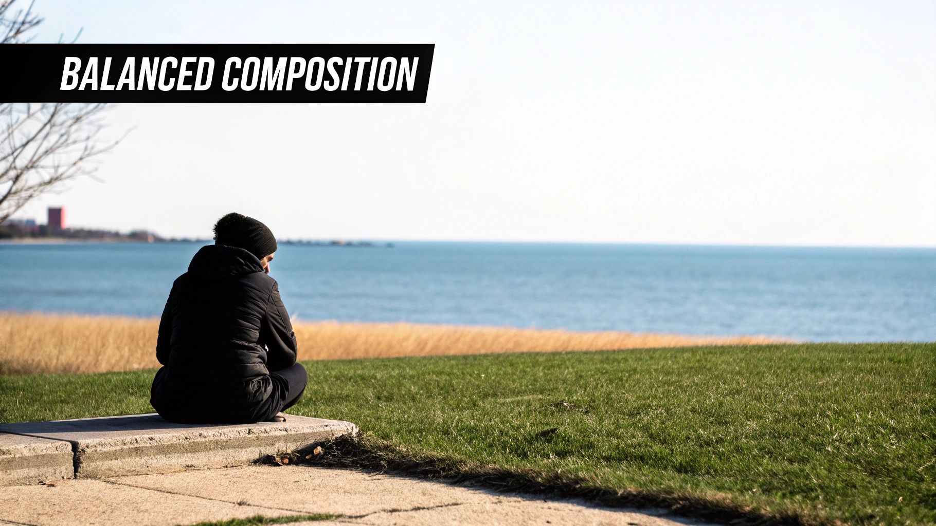
This principle moves beyond simple aesthetics; it’s about directing focus and creating a narrative flow. By positioning a person, product, or focal point off-center, you create negative space that gives the subject "breathing room" or implies movement and direction. It’s a simple yet incredibly effective way to make your images and videos feel professional and intentional rather than like simple snapshots.
How to Implement This Technique
- Activate Grid Overlays: Most cameras and editing apps have a grid overlay feature. Turn it on to help you visualize the Rule of Thirds grid as you shoot or edit, making precise placement easy.
- Position Subjects at Intersections: Place the most important elements of your story, like a character's eyes or a key product feature, on one of the four intersection points to immediately draw the viewer's attention.
- Align Horizons: When shooting landscapes or backgrounds, align the horizon with either the top or bottom horizontal line. Placing it in the middle can visually cut the image in half and feel less dynamic.
- Break the Rule with Purpose: Centering a subject can be powerful for creating a sense of symmetry, stability, or direct confrontation. Use this intentionally to create a specific impact that contrasts with more dynamic compositions.
For example, a travel influencer might place a mountain peak on an upper-right intersection to draw the eye there, while leaving the rest of the frame open to showcase the vast landscape. Similarly, a product shot might place the item on the left vertical line, leaving negative space on the right for ad copy. Mastering this simple compositional rule is a key step in elevating your visual narrative.
3. Montage and Sequence Editing
Montage is a powerful video technique where you combine multiple short clips in a sequence to compress time, convey a larger idea, or build intense emotion. This visual storytelling technique works by juxtaposing images to create a new, combined meaning that is more impactful than any single shot could be on its own. It allows you to guide the audience through a process, show character development, or build suspense in a condensed, dynamic format.
From the classic training montages in films like Rocky to the fast-paced, rhythmic edits in music videos, this method is designed for maximum psychological impact. On social media, it's perfect for "behind-the-scenes" reels, product creation processes, or event recaps. The rapid succession of images, often set to music, captures attention and delivers a substantial amount of narrative information efficiently.
How to Implement This Technique
- Establish a Clear Rhythm: The pacing of your edits is crucial. Use quick cuts to build energy and excitement or slower transitions to create a more reflective or emotional mood.
- Maintain Visual Consistency: Ensure all clips within your montage share a similar color grade and lighting style. This visual cohesion prevents the sequence from feeling disjointed and jarring to the viewer.
- Amplify with Audio: Select a music track or sound design that complements the pace and emotional tone of your montage. The audio should work in harmony with the cuts to enhance the overall effect.
- Tell a Mini-Story: Even a short montage should have a beginning, middle, and end. Arrange your clips to show clear progression, such as a problem, the work, and the final solution or result.
For example, a fashion brand could use a montage to show the entire process of a garment's creation, from initial sketch to the final runway look, all in a 30-second reel. A fitness influencer might compile clips from a week of workouts to show dedication and progress. Mastering this is a key part of effective video editing for social media, turning simple clips into a compelling narrative.
4. Typography and Visual Hierarchy
Typography is more than just readable text; it's a critical element that shapes the voice, tone, and flow of your narrative. This visual storytelling technique involves the strategic use of fonts, sizes, weights, and positioning to establish a clear visual hierarchy. This hierarchy guides the viewer's eye, ensuring they process information in the intended sequence and grasp the story’s core message without confusion. A well-chosen typeface can convey personality, from elegant and modern to bold and rebellious, adding another layer of emotional context to your content.
Effective visual hierarchy makes content scannable and digestible, which is crucial for capturing attention on fast-paced social feeds. By making the most important element (like a headline or a key statistic) the most visually prominent, you control the narrative's entry point. From there, you can lead the audience through supporting details with less prominent subheadings and body text, creating a logical and effortless viewing experience.
How to Implement This Technique
- Limit Your Typefaces: Stick to two or three complementary font families to maintain a clean and professional look. A common practice is to pair a serif font with a sans-serif font for contrast and clarity.
- Establish Clear Hierarchy: Use variations in size, weight (bold, regular, light), and color to distinguish between headings, subheadings, and body text. Your primary message should always be the most eye-catching element.
- Prioritize Readability: Ensure your text is legible across all devices. For body copy, aim for a minimum size that is comfortable to read on a mobile screen, and check that your text has sufficient contrast against its background.
- Consider Emotional Impact: Select fonts that align with your brand's personality and the story's emotion. A formal serif font might suit a luxury brand, while a geometric sans-serif could be perfect for a tech startup.
For example, a promotional graphic for a webinar could use a large, bold, and dynamic font for the event title to create excitement. The speaker’s name and the date could be in a smaller but still prominent font, with the finer details in a simple, readable body font. Mastering this is one of the essential visual storytelling techniques for clear and impactful communication.
5. Leading Lines and Depth Perception
Leading lines are one of the most fundamental and effective visual storytelling techniques for guiding the viewer's gaze and creating a sense of three-dimensional space. This technique uses natural or artificial lines within the frame, such as roads, fences, shadows, or architectural elements, to create a pathway that directs the eye toward a specific focal point. By doing so, you can control the narrative flow and emphasize the most important part of your story.
This method transforms a flat, two-dimensional image into an immersive experience by adding perceived depth and dimension. The lines don't just point; they pull the viewer into the scene, making the composition feel more dynamic and engaging. Whether it’s a winding river leading to a distant mountain or the converging lines of a skyscraper drawing the eye upward, this technique adds structure and purpose to your visuals.
How to Implement This Technique
- Scout for Natural Pathways: Before shooting, actively look for existing lines in your environment. Roads, hallways, coastlines, and even rows of trees can serve as powerful compositional tools.
- Position Your Subject Strategically: Place your key subject or product at the end or convergence point of the leading lines. This naturally makes it the hero of the image and the ultimate destination for the viewer's eye.
- Experiment with Different Angles: A low angle can make lines appear more dramatic and converge more quickly, enhancing the sense of depth. A high angle can reveal patterns and pathways that aren't visible from eye level.
- Combine with Other Techniques: Pair leading lines with a shallow depth of field to make your focal point even more prominent. The blurred background will complement the strong directional cues of the lines.
For example, a travel blogger can use a photo of a long, winding road disappearing into a mountain range to evoke a sense of journey and adventure. Similarly, a real estate brand might use the architectural lines of a hallway to guide viewers toward a beautifully staged living room, creating an inviting and spacious feel.
6. Character Visual Design and Symbolism
The visual design of a character is a form of silent storytelling that instantly communicates personality, status, and narrative role. This technique uses costume, color, physical traits, and accessories to give the audience a deep understanding of a character before they say a single word. By embedding symbolism into a character's appearance, you create a powerful shortcut to their core essence and thematic function.
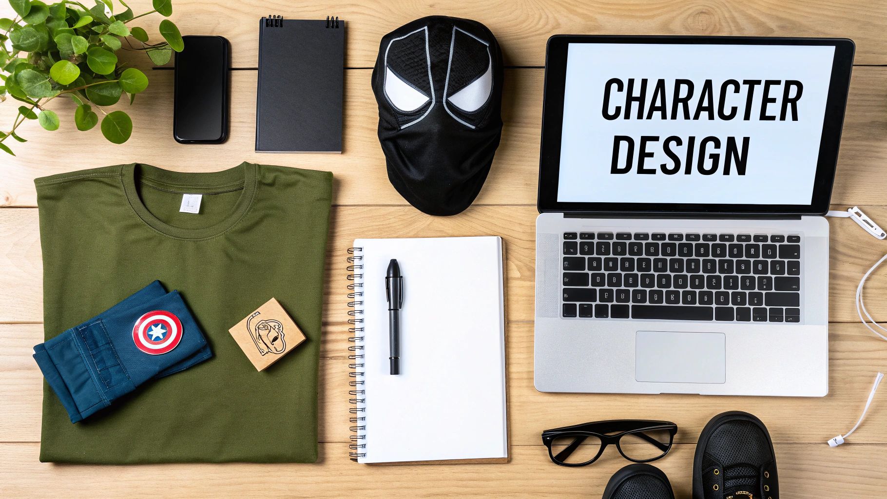
This method goes beyond simple aesthetics; it’s about strategic communication. The sharp, angular design and dark colors of a classic Disney villain immediately signal malice, just as a superhero's bright costume and strong silhouette convey hope and power. Every visual choice, from the fabric of a costume in a period drama to an accessory a brand mascot wears, tells a part of the story.
How to Implement This Technique
- Define Core Traits: Before designing, list the character's primary personality traits, their role in the narrative, and their emotional journey. Use this as a blueprint for all visual decisions.
- Use Shape and Color Psychology: Assign colors and shapes that reinforce personality. Soft, rounded shapes can suggest friendliness and safety, while sharp, angular forms can imply danger or aggression.
- Design a Recognizable Silhouette: A strong, unique silhouette makes a character instantly identifiable, even at a distance or in shadow. Test your designs to ensure they are distinct.
- Evolve Appearance with Development: If your character undergoes a significant change, reflect this transformation in their visual design. A change in costume or color palette can powerfully signify internal growth. For more details on this process, learn how to create animated characters.
For example, a tech startup's mascot designed for trustworthiness might have soft, circular features and a blue color scheme. In contrast, a brand mascot for an extreme sports company might feature jagged lines, bold reds, and a dynamic pose to convey energy and risk. This is one of the most fundamental visual storytelling techniques for creating a lasting emotional connection.
7. Visual Metaphor and Symbolism
Visual metaphor and symbolism is the art of using objects, actions, or compositions to represent abstract ideas far beyond their literal meaning. This advanced visual storytelling technique creates a layered narrative where a simple image carries profound symbolic weight. Instead of stating a concept directly, you communicate it through imagery, allowing your audience to connect with complex themes on a deeper, more intuitive level and transforming simple visuals into powerful statements.
This technique elevates your content from merely descriptive to truly poetic. For example, a shattered mirror in a social media post could symbolize a broken promise or fractured identity, while a lone seedling growing through concrete could represent resilience and hope. The power lies in showing, not telling, and trusting the audience to uncover the intended meaning.
How to Implement This Technique
- Establish Your Symbols: Choose an object or image to represent a core theme. A luxury watch brand might use an hourglass to symbolize timelessness, not just timekeeping.
- Repeat and Evolve: Introduce your symbol and then repeat it in different contexts throughout a campaign or story to reinforce its meaning. Show the seedling from the previous example growing stronger in subsequent posts.
- Balance Metaphor with Clarity: Ensure your metaphor is not so abstract that the audience misses the point. The context should provide enough clues for interpretation without explicitly explaining the symbolism.
- Consider Cultural Context: Be mindful that symbols can have different meanings across cultures. Research your target audience to ensure your intended message is received correctly and avoids unintended interpretations.
In practice, a tech startup could use imagery of climbing stairs or mountains in their social media to visually represent the journey of overcoming business challenges. A non-profit fighting pollution might use a recurring image of a bird trapped in plastic. This is one of the most effective visual storytelling techniques for adding intellectual and emotional depth to your narrative.
8. Camera Movement and Dynamic Framing
The way a camera moves is a storytelling decision, not just a technical one. This visual storytelling technique uses intentional camera movements like pans, tilts, and tracking shots to guide the audience's perspective, build suspense, and create an immersive experience. A static shot can feel objective and calm, while dynamic movement can inject energy, unease, or intimacy into a scene.
Dynamic framing energizes otherwise static subjects, turning a simple product reveal into a dramatic event or a testimonial into a personal, authentic conversation. The speed and smoothness of the movement directly influence the emotional tone; a slow, steady track can create tension or awe, whereas a shaky, handheld style conveys immediacy and realism, making it a powerful tool for connecting with viewers on social media.
How to Implement This Technique
- Match Movement to Emotion: Use slow, deliberate movements like a gentle push-in to build anticipation or focus on a detail. Employ faster movements like a whip pan to create a sense of action and excitement.
- Reveal Information Strategically: Use a pan or a crane-up shot to gradually reveal a larger scene, a new character, or the full scale of a product. This creates a "wow" moment for the viewer.
- Combine Static and Dynamic Shots: Create a compelling rhythm in your videos by interspersing dynamic, moving shots with stable, static ones. This contrast prevents visual fatigue and makes the movement more impactful.
- Plan Your Movements: Before filming, storyboard or pre-visualize your camera movements. Knowing the start and end points of a shot ensures the motion serves a clear narrative purpose and looks professional.
For instance, a real estate creator might use a smooth, drone-like glide-through shot to give a virtual tour of a property, making the space feel expansive and luxurious. Conversely, a fitness influencer might use energetic handheld shots during a workout tutorial to make the audience feel like they are right there in the action. Using camera movement effectively is one of the most cinematic visual storytelling techniques for elevating your content.
9. Lighting Design and Mood Creation
Lighting is not just about visibility; it’s about sculpting the scene and dictating its emotional core. This technique involves the strategic use of light intensity, direction, and color to establish atmosphere, emphasize focal points, and communicate powerful emotional subtext. How you light a subject can transform a neutral scene into one of tension, romance, or joy, making it one of the most fundamental visual storytelling techniques for guiding audience perception.
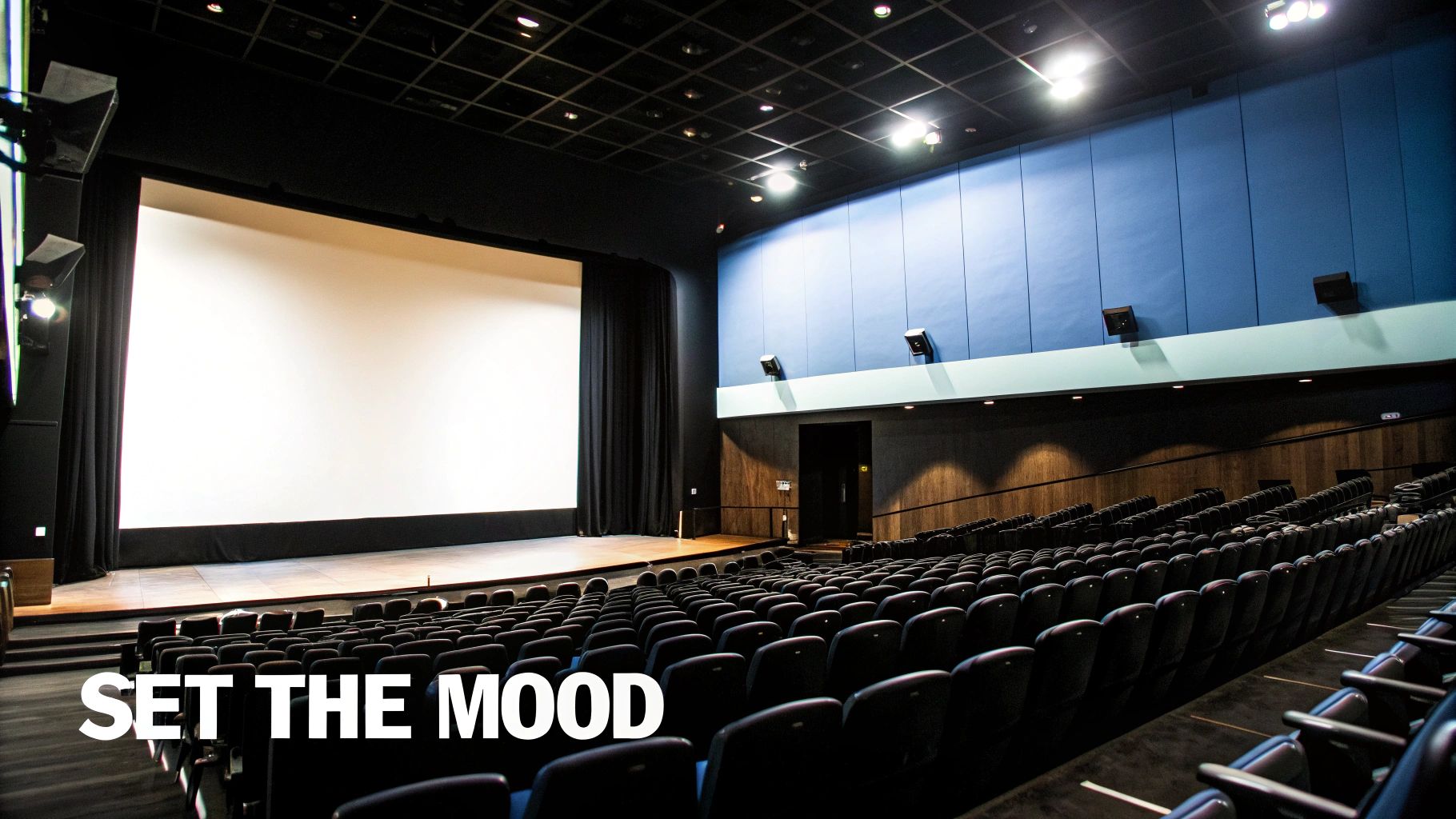
The difference between high-key lighting (bright, minimal shadows) and low-key lighting (high contrast, deep shadows) is the difference between a cheerful, upbeat mood and a dramatic, mysterious one. For instance, the dramatic shadows of film noir create suspense, while the soft, natural light in a documentary fosters authenticity. This control over light and shadow shapes how your audience interprets every frame.
How to Implement This Technique
- Define the Scene's Mood: Before setting up lights, determine the feeling you want to convey. Is it dramatic, soft, or energetic? This decision will dictate your choice between hard, direct light and soft, diffused light.
- Use the Three-Point System: Start with a classic three-point lighting setup (key, fill, and back light) to create depth and dimension. Adjust the intensity of each light to control contrast and mood.
- Incorporate Colored Gels: Use colored gels or smart lights to tint your lighting. A warm, golden light can evoke nostalgia or comfort, while a cool blue can suggest melancholy or a futuristic setting.
- Maintain Consistency: Ensure your lighting style remains consistent across a series of photos or video scenes to maintain a cohesive narrative tone and visual identity.
For example, a luxury brand might use soft, diffused lighting to create an elegant, high-end feel in its product shots. Conversely, a fitness brand might use harsh, high-contrast lighting to highlight muscle definition and convey intensity. To get started with a foundational setup, explore our guide on product photography lighting. By mastering light, you gain ultimate control over your story’s atmosphere.
10. Visual Contrast and Juxtaposition
Visual contrast is a fundamental principle that commands attention by placing opposing elements side-by-side. This visual storytelling technique uses the strategic juxtaposition of light versus dark, large versus small, or movement versus stillness to create tension, emphasize a focal point, and deepen narrative meaning. By forcing the viewer's eye to reconcile these differences, you make your story more dynamic and memorable.
The power of this technique lies in its ability to communicate complex ideas without words. Placing a vibrant, colorful element in a monochrome scene immediately signals its importance. Similarly, juxtaposing a massive object with a tiny one can instantly convey themes of scale, power, or vulnerability. It's a direct route to creating visual hierarchy and guiding the audience's interpretation.
How to Implement This Technique
- Identify Your Story's Core Conflicts: Determine the central thematic oppositions in your narrative, such as tradition versus innovation or nature versus technology. Use visual contrast to represent these ideas.
- Use Light and Shadow Deliberately: Employ high-contrast lighting (chiaroscuro) to create drama, mystery, or to highlight a subject’s features. This is a classic technique borrowed from film noir that works exceptionally well in photography and video.
- Juxtapose Scale and Shape: Place a small, intricate object next to a large, simple one to draw attention. This is effective for showcasing product details or creating a sense of awe in your compositions.
- Leverage Color Contrast: Use a complementary color scheme or place a single saturated color in a desaturated environment. This immediately tells the viewer where to look and what is most important in the frame.
For example, a tech company could juxtapose a sleek, modern device against an old, decaying background to highlight its innovation. A fashion brand might place a model in an elegant gown in a gritty, industrial setting to create a powerful and unexpected narrative. Mastering contrast is one of the most effective visual storytelling techniques for adding depth and impact to your content.
10-Point Visual Storytelling Techniques Comparison
| Technique | 🔄 Implementation complexity | ⚡ Resource requirements | 📊 Expected outcomes | 💡 Ideal use cases | ⭐ Key advantages | |---|---:|---|---|---|---| | Color Psychology and Emotional Palettes | Medium — research, cultural checks, testing | Low–Medium: designers, palette tools, user tests | Strong emotional cues, improved recall | Branding, UI, animation, mood-driven scenes | ⭐ Immediate nonverbal emotion; enhances recognition | | Composition and Rule of Thirds | Low — straightforward grid-based framing | Low: camera/grid overlays, basic training | Balanced compositions, clearer focal points | Photography, film framing, social feeds | ⭐ Easy to learn; improves visual professionalism | | Montage and Sequence Editing | High — pacing, thematic juxtaposition, editorial skill | Medium: editing software, footage, editor time | Condensed narrative, emotional build, thematic links | Trailers, film sequences, music videos, social clips | ⭐ Compresses time; creates powerful juxtaposition | | Typography and Visual Hierarchy | Medium — typographic rules, testing for readability | Low–Medium: fonts, designers, accessibility checks | Clear information flow, reinforced tone and brand | Title sequences, UX/UI, print and digital layouts | ⭐ Guides reading order; strengthens brand voice | | Leading Lines and Depth Perception | Medium — scouting and intentional framing | Low: lens choices, positioning, location scouting | Perceived depth, guided viewer gaze | Landscape, architecture, cinematography, portraits | ⭐ Subconscious guidance; adds dimensionality | | Character Visual Design and Symbolism | High — concepting, cultural research, iterations | Medium–High: costume, props, designers, fittings | Instant character cues, enhanced memorability | Film, games, animation, theatre, branding | ⭐ Conveys personality silently; tracks character arc | | Visual Metaphor and Symbolism | High — conceptual clarity, consistent motif planning | Low–Medium: props, set design, research | Layered themes, audience interpretation, depth | Art films, advertising, editorial, fine art | ⭐ Communicates complex ideas concisely and poetically | | Camera Movement and Dynamic Framing | High — choreography, rehearsal, technical skill | High: rigs (Steadicam, drone), crew, planning time | Immersion, reveal pacing, emotional motion | Narrative films, documentaries, action sequences | ⭐ Reveals information dynamically; increases immersion | | Lighting Design and Mood Creation | High — technical setups, color and exposure control | High: lighting gear, skilled crew, time for setup | Defined atmosphere, emphasis, perceived texture | Film, photography, commercials, stage | ⭐ Shapes mood and visibility; defines scene tone | | Visual Contrast and Juxtaposition | Medium — conceptual planning and balance | Low–Medium: styling, set/prop decisions | Immediate attention, thematic emphasis, tension | Advertising, editorial, film scenes, posters | ⭐ Highlights differences; strengthens thematic clarity |
Turn Theory into Viral Content: Your Next Steps
We've journeyed through ten powerful visual storytelling techniques, from the emotional weight of Color Psychology to the dynamic energy of Camera Movement and the subtle genius of Visual Metaphor. Each one is a potent tool in your creative arsenal, capable of transforming a simple post into a memorable narrative that resonates with your audience and drives action. But knowledge alone doesn't build a brand; application does. The true value of these concepts is unlocked when they are consistently and strategically woven into your content creation workflow.
The transition from understanding theory to mastering implementation is where many creators stall. It's not enough to know what the Rule of Thirds is; you must actively frame your shots with it in mind. It’s not enough to appreciate the impact of a well-designed lighting setup; you must experiment with light and shadow to craft the specific mood your story requires. This deliberate practice is what separates fleeting content from an enduring brand identity.
From Learning to Launching
To avoid feeling overwhelmed, don't try to implement all ten techniques at once. Instead, adopt a focused, incremental approach. Your mission for the next two weeks could be to concentrate on just two or three related concepts. For example:
- Combine Color Psychology with Lighting Design: Start by defining a core emotional palette for your brand. Then, use lighting to either amplify or intentionally contrast with those colors, creating scenes that are rich in mood and atmosphere.
- Pair Composition with Leading Lines: Make the Rule of Thirds your default framing guide. Then, actively search for and create leading lines within your compositions to guide the viewer’s eye directly to your focal point, whether it's a product, a person, or a call-to-action button.
- Integrate Montage and Visual Contrast: When editing your next video or Reel, think like a storyteller. Use montage editing to compress time and build excitement, then strategically insert moments of high visual contrast to punctuate key messages or emotional beats.
By isolating these techniques, you can consciously practice them until they become second nature. Track your analytics during these experiments. Did a video using dynamic framing and sequence editing outperform a static post? Did content with a strong visual hierarchy in its typography see a higher click-through rate? This data-informed approach turns creative experimentation into a reliable growth strategy. Mastering these visual storytelling techniques is your key to cutting through the noise, fostering a deeper connection with your audience, and turning passive scrollers into loyal customers.
Ready to put these techniques into practice without the friction of complex software? ViewPrinter is an all-in-one AI-powered platform designed to bring your visual stories to life. Effortlessly generate media, create dynamic slideshows, and edit high-converting ads using the very principles discussed in this guide. Start your free trial today and transform your creative vision into compelling content. ViewPrinter