
Build a Better Social Media Reporting Template
Build a social media reporting template that gets results. This guide shows you how to pick KPIs, design for clarity, and automate your workflow.
At its core, a social media reporting template is just a pre-built document or dashboard for tracking your performance. It’s designed to take all those raw numbers—likes, shares, clicks, you name it—and turn them into something you can actually use. It helps you tell a story about what’s working, what isn’t, and where the real opportunities are hiding.
Moving Beyond Manual Social Media Reporting
Let's be real: pulling social media reports by hand is a soul-crushing task. It's not just that it eats up your time; it’s a genuine bottleneck that slows down your strategy. When you're busy copy-pasting data from five different platforms into a messy spreadsheet, you’re not looking for insights. You're just trying to get it done.
This manual grind often leads to inconsistent reports, missed trends, and a frustratingly slow reaction time. You might not realize a certain ad is killing it until a week after you should have doubled its budget.

The goal here is to stop thinking of a social media reporting template as just another document. See it for what it is: a strategic tool for clear, consistent communication. A great template turns a chaotic jumble of metrics into a coherent story that gets your team, your clients, and your boss all on the same page.
The True Cost of Inefficient Reporting
The hours you lose to manual reporting are bad, but the missed opportunities are what really hurt. Imagine finding out—a week too late—that one specific video creative was driving 90% of your conversions, but its budget ran out days ago. Manual reporting creates these kinds of expensive blind spots.
The greatest danger in times of turbulence is not the turbulence; it is to act with yesterday's logic. A proper reporting structure ensures you're acting on today's data, not last month's assumptions.
This is exactly where a template saves the day. By standardizing what you track and how you present it, you create a single source of truth. Teams that use templates make decisions faster—some agencies report being able to pivot their campaigns 30-40% quicker. It's no wonder that roughly 80% of digital marketing teams now rely on some form of template-based system. It’s quickly becoming the standard way to work.
To give you a clearer picture, here’s a quick rundown of what you gain by switching to a template system.
Template Benefits at a Glance
| Benefit | Impact on Your Workflow | | :--- | :--- | | Consistency | Every report follows the same format, making data easy to compare week-over-week or month-over-month. No more apples-to-oranges comparisons. | | Time Savings | Drastically cuts down on the manual labor of data entry and formatting. You can spend more time analyzing and less time building. | | Clarity | Presents data in a clear, digestible way for all stakeholders, from marketing specialists to C-suite executives. | | Faster Insights | A standardized view helps you spot trends, anomalies, and opportunities much faster than sifting through raw data. |
Ultimately, a template-driven approach lets you focus on strategy instead of getting bogged down in administrative tasks.
Creating a System for Clarity
A well-designed template does more than just show numbers; it builds a narrative. It should effortlessly guide anyone reading it from a high-level performance summary down to the nitty-gritty details, all without causing confusion.
If you really want to level up, think about building a comprehensive social media analytics dashboard that everyone can access. This approach ensures that everyone, from the social media manager to the CEO, can see what’s happening at a glance and make smart decisions on the fly. You're not just reporting on the past; you're actively turning your data into a driver for future growth.
Choosing the KPIs Your Stakeholders Actually Care About
Let’s be honest: reporting on vanity metrics is the fastest way to make your stakeholders’ eyes glaze over. A massive follower count looks great on the surface, but if you can't connect it to a real business outcome, it's just a number. The best social media reporting templates are built around the specific key performance indicators (KPIs) that matter to the person reading the report.
Think about it. Your CMO is laser-focused on ROI and how much it costs to acquire a new customer. Meanwhile, your content team is probably way more interested in engagement rates and audience sentiment to figure out what to create next. Tailoring the story to the audience isn't just a good idea—it's everything.
Turning Business Goals into Trackable Metrics
The first move is always to translate those big-picture company goals into specific, tangible social media metrics. If the business wants to grab more market share, your report needs to highlight share of voice and how you stack up against the competition. If the goal is to build a loyal customer base, you should be tracking things like repeat engagement rates and shining a spotlight on user-generated content (UGC).
For an e-commerce brand, this is pretty direct:
- Business Goal: Boost online sales by 15% this quarter.
- Social Media KPIs: That means you're tracking Return on Ad Spend (ROAS), Conversion Rate from social referrals, and the Average Order Value (AOV) of shoppers who came from your social channels.
A B2B company, on the other hand, will have a totally different set of priorities:
- Business Goal: Funnel more qualified leads to the sales team.
- Social Media KPIs: You’ll be monitoring gated content downloads (like whitepapers), LinkedIn lead gen form submissions, and the click-through rates (CTR) on your webinar registration links.
The real art of reporting isn't just showing the data; it's showing the right data. A great report answers your stakeholders' biggest questions before they even have a chance to ask them.
The world of social media metrics has exploded, with some reports now tracking over 30 different indicators. While old standbys like engagement, reach, and impressions are still tracked by about 95% of teams, the focus is definitely shifting. For example, 88% of e-commerce brands now keep a close eye on CTR to attribute sales correctly. We're also seeing more sophisticated metrics like sentiment analysis showing up in 65% of professional templates.
Different KPIs for Different Audiences
A truly useful template needs to be flexible. It should let you swap out KPIs depending on the business model because a content creator’s success isn’t measured in ROAS—it’s measured in audience loyalty and brand partnership value.
Here’s a quick breakdown of how to tailor your focus:
- For Agencies: Clients need to see progress and proof that their investment is paying off. Your reports should highlight month-over-month growth in crucial areas like lead generation, website traffic, and overall engagement.
- For Creators: It’s all about the community. Prioritize metrics that show a strong connection, like audience retention on videos, engagement rate per post, and even the number of direct messages you receive.
- For E-commerce: It all comes down to sales. Your report must feature social-driven revenue, product page views from social, and cart abandonment rates for users clicking through from your social media profiles.
The table below breaks down which metrics tend to matter most for each of these business types.
KPI Selection Framework by Business Type
A comparison of essential social media KPIs tailored to different business models, helping you prioritize what to track.
| Metric Category | E-commerce Focus | Agency Focus | Creator Focus | | :--- | :--- | :--- | :--- | | Awareness | Reach, Impressions, Share of Voice | Brand Mentions, Follower Growth | Video Views, Profile Visits | | Engagement | Likes, Comments, Shares, Saves | Engagement Rate, Clicks, UGC | Audience Retention, Comments, DMs | | Conversion | ROAS, Conversion Rate, AOV | Leads Generated, Form Fills, CTR | Affiliate Clicks, Merch Sales | | Loyalty | Repeat Customer Rate, Reviews | Client Retention, Testimonials | Follower Growth Rate, Saves |
Ultimately, choosing the right metrics transforms your report from a simple data dump into a powerful strategic tool. It's about getting beyond the surface-level numbers to understand the true impact of your work.
To really nail this, you need to master the most relevant social media key performance indicators for your specific goals. And if you want to go even deeper, check out our complete guide on which social media metrics to track.
How to Design a Report People Will Actually Read
Let's be honest: a wall of numbers guarantees one thing. Your report will be ignored.
Effective reporting is as much about design and storytelling as it is about data. A great social media reporting template doesn't just present numbers; it builds a compelling narrative that guides your boss or client to the right conclusions.
The key is to create a logical flow. I always start with a top-line executive summary—just a few bullet points covering the most important takeaways. This is a lifesaver for busy executives who might not read past the first page. From there, you can zoom in, breaking down performance by platform or campaign.
Choosing the Right Visuals for Your Data
How you visualize data is everything. The right chart makes complex information instantly digestible, but the wrong one can completely obscure your message. Think of yourself as a data translator, turning raw numbers into an intuitive visual story.
Here’s a quick guide I use to match data with the right chart type:
- Line Charts: These are perfect for showing trends over time. I use them to track things like follower growth, website clicks, or engagement rates month-over-month. They tell a story of progress.
- Bar Charts: Need to compare distinct categories? Bar charts are your best friend. They're ideal for showing which platform drove the most traffic or which content format got the most shares.
- Pie Charts: Use these sparingly. But for showing parts of a whole—like the demographic breakdown of your new followers—they work beautifully.
A great report balances these visuals with concise text. Never just drop a chart onto the page without context. I always add a short sentence or two explaining what the chart shows and, more importantly, why it matters.
Weaving a Narrative with Qualitative Insights
The most impactful reports are the ones that combine hard data with human insights. Numbers tell you what happened, but your insights explain why. This is where you transform a simple data dump into a truly strategic guide.
For instance, next to a chart showing a spike in engagement, add a note: "This spike correlates with our shift to user-generated content, suggesting our audience responds really well to authentic visuals." For more ideas on blending data with insights, check out our detailed guide on building a powerful social media analytics dashboard.
A report without insights is just noise. Your value isn't in pulling the numbers; it's in explaining what those numbers mean for the business and what should be done next.
Teams that switch to branded, customized templates see huge improvements in communication. In fact, 76% of teams note that visual, chart-based reporting makes it easier to understand campaign results. On top of that, 84% of marketing professionals say structured templates help them spot opportunities for optimization. You can see more insights about how templates improve reporting on asana.com.
By focusing on clear design and actionable analysis, you create a document that people won't just read—they'll actually use it.
Building Your Template in Google Sheets or Excel
Alright, you’ve got your KPIs and a design in mind. Now it's time to roll up your sleeves and actually build this thing in Google Sheets or Excel. The real magic isn't just typing numbers into cells; it's about making the spreadsheet do the heavy lifting for you.
Every report starts with a raw data export from a social platform. You know the one—it's a messy CSV with a hundred columns you don't need. The goal isn't to manually clean that file every single month. That's a nightmare. Instead, we're going to build a system that pulls exactly what you need, automatically.
Think of it as a simple, three-stage process: you take the raw data, visualize it, and then pull out the insights.
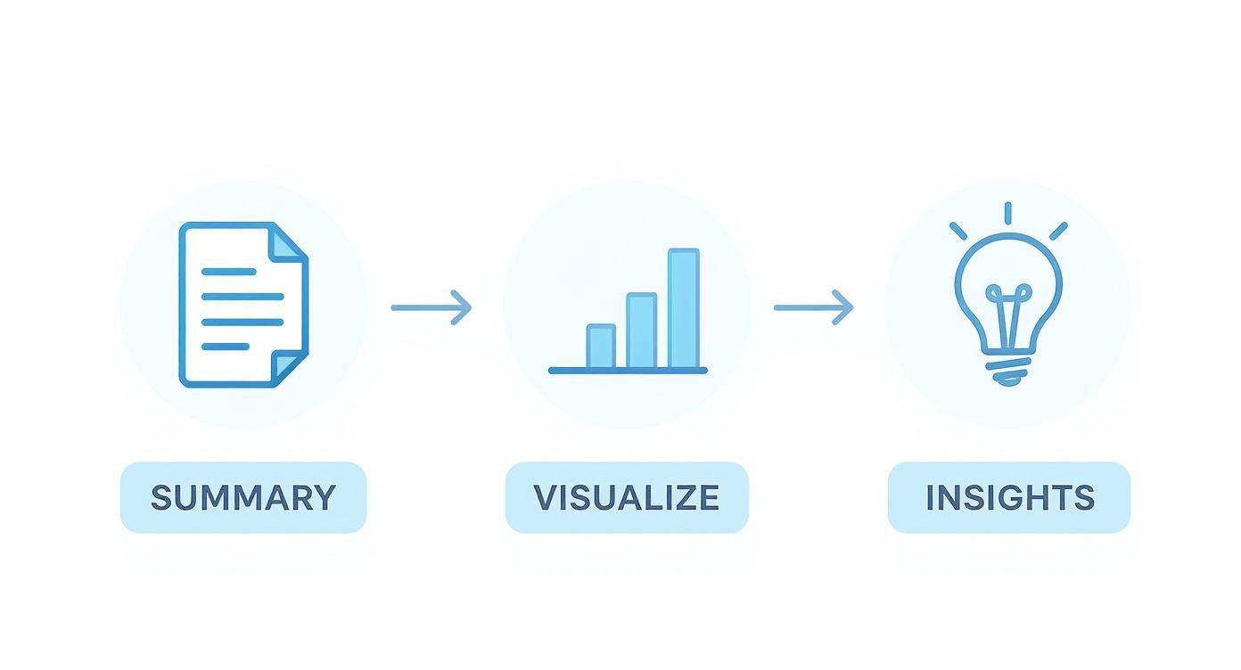
This workflow is a reminder that good reporting isn't just about collecting numbers. It's about turning a pile of data into a story that makes sense.
Mastering Essential Spreadsheet Functions
To build a template that doesn't break, you only need to master a few key formulas. These functions are the engine of your report, grabbing and organizing data so you don't have to.
-
INDEX/MATCH or VLOOKUP: These are your best friends for pulling specific data points from a raw data tab into your clean dashboard. For example, you can use them to find the "Total Reach" for a specific post from a massive export. I personally lean towards
INDEX/MATCHbecause it’s way more flexible and won't break if you add or remove columns in your source data. -
SUMIFS or COUNTIFS: Absolutely essential for adding things up. Let's say your raw data has a "Campaign Name" column. You can use
SUMIFSto instantly total all the clicks, impressions, and conversions for just the "Q3 Product Launch" campaign. -
IFERROR: This little function is a lifesaver for keeping your report looking professional. Just wrap your other formulas in
IFERRORto show a "0" or even a blank cell instead of an ugly "#N/A!" error when data is missing.
I like to structure my spreadsheets with three tabs: one for the raw data dump, a second "calculations" tab where all these formulas live, and a final, polished dashboard tab that just references the calculation tab. It keeps everything neat and makes troubleshooting so much easier.
Slicing and Dicing Data with Pivot Tables
When you’re staring down a huge dataset, especially from ad platforms, pivot tables are a total game-changer. Instead of writing a bunch of complicated formulas, a pivot table can summarize everything in seconds.
For instance, you could drop your entire Facebook Ads export into a sheet, create a pivot table, and instantly see:
- Total spend per campaign
- Click-through rate by ad creative
- Cost per conversion broken down by audience demographic
Pivot tables let you ask questions of your data without being locked into a rigid structure. They're perfect for digging around and exploring before you decide which metrics deserve a spot in your final, polished report.
Automating Data Imports with Add-Ons
Okay, let's be honest. Manually exporting and pasting data is the single biggest time-waster in reporting. This is where you bring in the big guns: spreadsheet add-ons. Tools like Supermetrics or Power My Analytics connect directly to the social media APIs and pull data into your Google Sheet on whatever schedule you set.
Just imagine your template automatically refreshing with the latest data from Instagram, Facebook, and TikTok every morning at 8 AM. This one move eliminates 100% of the manual data entry, freeing you up to do what you're actually paid for: analyzing the results and finding those game-changing insights. This is the final step to creating a truly efficient social media reporting machine.
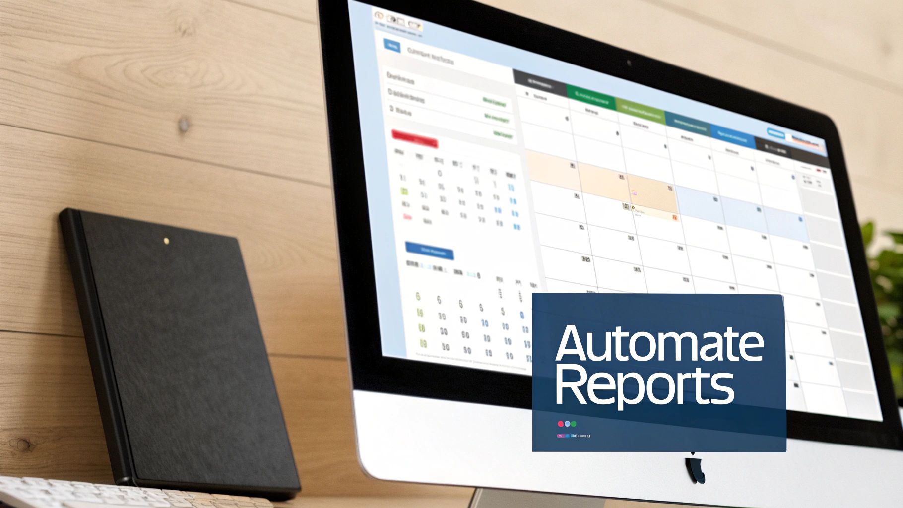
Automating and Scaling Your Reporting Workflow
A great social media reporting template is a fantastic start, but let's be honest—its real power comes from automation. Manually updating even the slickest template every week is a surefire way to get bogged down in mind-numbing, repetitive work. True efficiency kicks in when your reports essentially build themselves, freeing you up to focus on actual strategy instead of endless spreadsheet gymnastics.
The first move is setting up scheduled data refreshes. By using tools that plug directly into social media APIs, you can tell your Google Sheet or dashboard to pull in the latest numbers every single morning. This means whenever a stakeholder pops by asking for an update, the data is already fresh. No more last-minute scrambles to export and format new files.
Suddenly, your template transforms from a static document into a living, breathing resource.
Creating Dynamic, Accessible Dashboards
The days of emailing around clunky PDF attachments are numbered. A much smarter approach is to create dynamic dashboards in tools like Google's Looker Studio, which can connect directly to your spreadsheet template. This gives your team or clients a single link they can visit anytime for a real-time view of performance. It’s a game-changer.
A live dashboard gives you a few massive advantages over static files:
- Always Current: The data reflects the latest performance without you having to do a thing.
- Interactivity: Stakeholders can filter by date, platform, or campaign to dig into the data themselves.
- Reduced Admin: You completely cut out the whole export-format-email song and dance.
This simple shift moves reporting from a periodic "event" to a continuous, accessible process. Trust me, your stakeholders will love it.
By automating the delivery of data, you change the conversation from "What happened last month?" to "What should we do next based on what's happening right now?"
Connecting Your Template to a Full Workflow
For peak efficiency, you can integrate your reporting template into a much larger system that automates not just the data, but the distribution, too. Imagine a workflow where your spreadsheet automatically populates a beautifully designed report, which then gets sent to the right client or department head every Monday at 9 AM—all without you lifting a finger.
This is exactly how smart agencies and in-house teams scale their capacity. Instead of just hiring more people to create more reports, they build systems that handle all the busywork. To see how this fits into a broader strategy, it’s worth exploring how to build a more efficient system with marketing workflow software. This is the secret to managing reporting for dozens of clients or campaigns without sacrificing quality or losing your sanity.
Your Top Social Media Reporting Questions, Answered
Even with the perfect template in hand, questions always come up. Building the report is just the first step. The real challenge is using it effectively and consistently. Let's dig into some of the most common sticking points to help you nail down your process.
One of the biggest uncertainties I see is around timing. How often should you actually be pulling and sharing these reports? There’s no magic number, but finding the right rhythm is all about who’s reading it.
How Often Should I Update My Social Media Report?
The ideal reporting cadence depends entirely on who you're talking to and what they need to do with the information. Get the timing wrong, and you’re either drowning your team in data or leaving them blind to key opportunities.
For your internal marketing crew—the people actually running the campaigns—weekly or bi-weekly updates are a must. This speed lets them pivot quickly. They can spot an underperforming ad before it wastes too much budget or throw more fuel on a post that's starting to go viral.
But for clients or your leadership team, a monthly report usually hits the sweet spot. It's often enough to show real progress and identify trends without getting bogged down in daily noise. Save the quarterly reports for those big-picture strategic reviews, annual planning, and checking in on major goals.
The rule of thumb is simple: match the report's frequency to the audience's decision-making speed. Fast decisions need fresh data; long-term strategy needs a wider lens.
What Is the Best Format for a Social Media Report?
There is no single "best" format. What works brilliantly for an analyst might be completely useless for your CEO. The right choice always comes down to the audience and the report's purpose.
- Interactive Dashboards: Tools like Google's Looker Studio are fantastic for marketing teams who need to slice and dice the data themselves. They provide a live, dynamic look at what's happening.
- Polished PDFs or Decks: For clients or executives, a curated PDF or Google Slides deck is almost always better. This format lets you build a narrative, highlighting the most important takeaways and adding your own strategic analysis.
- Spreadsheets: While spreadsheets are the backbone of your template and essential for raw data work, they are rarely the best way to present your findings to anyone who isn't an analyst.
Always tailor the deliverable. A polished presentation tells a story; a dashboard is a tool for exploration. Choose wisely.
How Should I Report on Organic and Paid Social Together?
To get the full picture of your social media performance, you have to track both organic and paid efforts. The key is to keep them in distinct sections within your report. If you just lump everything together, you'll muddy the waters and make it impossible to see the true ROI of your ad spend.
Start your template with a high-level executive summary. This should combine key totals like overall reach, total engagement, and total conversions. It gives everyone a quick, 30,000-foot view of your total impact.
From there, break it down into dedicated sections:
- Organic Performance: This is where you focus on metrics like follower growth, organic reach, community engagement rates, and brand mentions. It’s all about brand health and audience connection.
- Paid Performance: Here, you get into the numbers. Detail your ad spend, ROAS, cost per click (CPC), cost per conversion, and any other metrics tied directly to your campaigns.
This structure makes it crystal clear how your organic and paid strategies work together while giving you a clean breakdown of your investment and its direct returns.
Ready to stop wrestling with spreadsheets and start creating stunning, automated reports? ViewPrinter provides the all-in-one platform you need to generate, schedule, and distribute professional social media reports that tell a clear, compelling story. Streamline your entire workflow at https://viewprinter.tech.