
What Is a Call to Action? Your Ultimate Guide to Driving Action
Struggling with conversions? Learn what is a call to action (CTA) and how to craft powerful ones that drive real results. Get examples, tips, and templates.
Ever wonder what turns a casual browser into an active customer? It's often a simple, direct instruction: a call to action (CTA).
A CTA is the prompt you see on a website, in an ad, or at the end of a piece of content that tells you exactly what to do next. It’s the crucial bridge between someone just consuming your content and them actually taking a meaningful step, like becoming a lead or making a purchase.
The Guiding Force Behind Every Click

Think of a CTA as the GPS for your audience. After someone reads your amazing blog post or watches your latest video, they're at a digital crossroads. Without a clear sign, they’ll probably just wander off. A CTA gives them that essential next step, pointing them exactly where to go.
This instruction can be anything from a big, bold button on a landing page to a simple question at the end of an email. Its job is to cut through the noise and guide users toward one specific, valuable action.
More Than Just a Button
Deep down, the call to action is the engine of your entire marketing strategy. Every single campaign, social media post, and email has a goal—generating leads, driving sales, or building a community. The CTA is what makes hitting that goal possible. It’s the moment you stop hinting and start asking.
Think about it. Different goals need different CTAs:
- Want more leads? Use "Download Your Free eBook" or "Get a Free Consultation."
- Need to drive sales? Try "Shop Now," "Add to Cart," or "Claim Your 25% Discount."
- Trying to boost engagement? Go with "Leave a Comment Below" or "Share This Post."
- Looking to grow your audience? Ask them to "Subscribe to Our Newsletter" or "Follow Us on Instagram."
A well-crafted CTA doesn’t just ask for a click. It offers a logical and valuable next step for the user. It transforms your one-way message into a two-way conversation that pulls your audience deeper into your world.
Ultimately, if you don't have a clear CTA, even the most brilliant content can fall flat. You'll leave potential customers interested but unsure of what to do next. This guide will show you how to build CTAs that get people to act.
Why Your Marketing Fails Without a Strong CTA
Ever seen a beautiful storefront with amazing things in the window, but no front door? People might stop and look, but they can't come inside to buy anything. That's exactly what your marketing looks like without a strong call to action.
A powerful CTA isn't just a "nice-to-have" detail; it's the specific instruction that turns someone who's just looking into a customer. Without it, you create a dead end. They read your blog post or watch your video, think, "Huh, that was cool," and then... what? That hesitation is where you lose them.
Guiding Your Audience and Eliminating Indecision
People are drowning in information and ads all day, every day. It leads to serious decision fatigue. A clear, simple CTA cuts right through that noise by telling them exactly what to do next. You're not being pushy—you're being helpful.
This is the whole point of direct response marketing, which is all about getting someone to take action right away. You can learn more by exploring what is direct response marketing in our detailed guide. A good CTA makes your marketing interactive, not just a one-way speech.
Think about it like this:
- Campaign A (No CTA): An e-commerce brand posts a slick video of a new product. The caption is great, but it doesn't ask the viewer to do anything. People watch, are impressed, and keep on scrolling.
- Campaign B (With a CTA): Same brand, same video. But this time, the caption says, "Tap the link in our bio to get yours before it sells out!" That simple sentence creates urgency and gives them a direct path to the checkout page.
A CTA is the bridge between your content and your business goals. It’s the engine that turns views into leads, likes into subscribers, and casual interest into actual sales.
Without that clear direction, your marketing might build some buzz, but it won't build your business.
From Monologue to Measurable Action
Ultimately, you want every piece of content to invite your audience to do something. A blog post can ask for comments. A video can ask for shares. A landing page can ask for an email sign-up. Each little ask builds the relationship and moves them one step closer to becoming a loyal customer.
When you leave out a CTA, you're just leaving money on the table. You did all the hard work to get their attention and give them something valuable. The CTA is how you cash in on that effort.
At the end of the day, a strong CTA is the backbone of any real conversion optimization strategy. It’s what turns your marketing monologue into a conversation that actually drives results.
Choosing the Right Type of CTA for Any Goal
Let's get one thing straight: not all calls to action are created equal. Slapping a "Shop Now" button on a blog post meant to build your email list is like trying to use a hammer to saw a piece of wood. It's the wrong tool for the job. To get real results, you have to stop using a one-size-fits-all approach and start picking your CTAs with surgical precision.
Think of your CTA as the final instruction you give someone. What you ask them to do next has to make sense based on everything they just saw, read, or watched. Get it right, and you create a smooth path to conversion. Get it wrong, and you create a dead end.
This diagram paints a clear picture of the two roads your marketing can take. One leads nowhere without a CTA, while the other opens the door to engagement and sales.
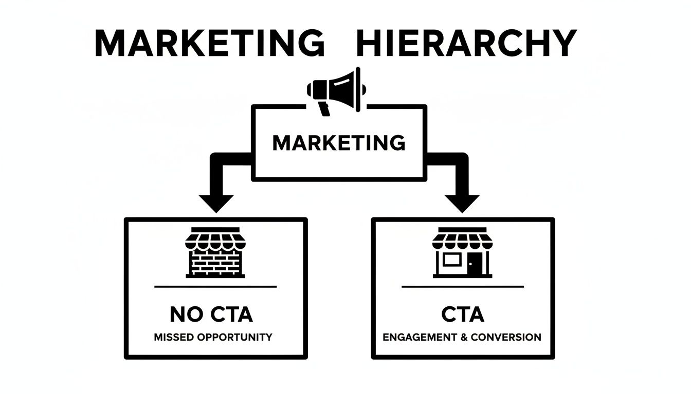
A CTA isn’t just some extra button you add at the end. It's the bridge that connects your audience's interest to a meaningful action.
How to Match Your CTA to Your Marketing Goal
So, how do you pick the perfect one? The secret is to work backward from your objective. Before you write a single word, ask yourself: "What is the one thing I absolutely need someone to do right now?" Your answer is your guide.
This simple question helps you cut through the noise and focus on the most important next step for your audience. Let's look at how different goals lead to different types of CTAs.
The Three Main Flavors of CTAs
Most calls to action fall into one of three buckets, each tied to a specific marketing goal.
-
Lead Generation CTAs: The goal here isn't to make a sale—not yet. It's about starting a conversation. You're offering something valuable (a guide, a quote, a checklist) in exchange for their contact info, usually an email. This is crucial because an estimated 96% of first-time visitors to your site aren't ready to buy anything.
- Examples: "Download Your Free Guide," "Get Your Custom Quote," "Join Our Waitlist."
-
Sales & Conversion CTAs: This is where you go for the close. The user is ready, their interest is high, and it's time to make the ask. These CTAs are direct, clear, and often create a sense of urgency. You'll find them on product pages, in final-offer emails, and all over retargeting ads.
- Examples: "Add to Cart," "Complete Your Purchase," "Claim Your 30% Discount Now."
-
Engagement & Community CTAs: Sometimes, the most valuable action isn't a transaction—it's an interaction. These CTAs are all about building relationships and fostering a community around your brand. They encourage people to share, comment, and connect, which helps boost your organic reach and build brand loyalty.
- Examples: "Join the Conversation Below," "Tag a Friend Who Needs This," "Share Your Story."
A Practical Guide to Picking the Right CTA
To make this even easier, think about where your audience is and what you want them to do there. The platform itself provides major clues about which CTA will work best.
Here’s a quick-reference table to help you align your call to action with your marketing goals and channels.
How to Match Your CTA to Your Marketing Goal
| CTA Type | Primary Goal | Example Phrasing | Best Placement | | :--- | :--- | :--- | :--- | | Lead Capture | Build Your Email List | "Download the Free Ebook" | Blog Posts, Landing Pages | | Direct Sale | Drive Revenue | "Buy It Now" | Product Pages, Sales Emails | | Nurturing | Guide to the Next Step | "Read the Full Story" | Email Newsletters, Case Studies | | Community Building | Boost Engagement | "Share Your Thoughts Below" | Social Media Posts, Blog Comments | | Event Promotion | Get Sign-ups | "Register for the Webinar" | Ads, Landing Pages, Social Bios | | Discovery | Encourage Exploration | "Explore Our New Collection" | Homepage Banners, Lookbooks |
By matching your CTA to both your immediate goal and the platform you're on, you're not just asking people to click a button—you're guiding them on a logical, intuitive journey. That clarity doesn't just feel better for them; it dramatically increases the odds they'll do exactly what you want them to.
How to Write CTAs That Actually Convert

Knowing what a CTA is and which type to use is only half the battle. The real magic happens in the execution. The difference between a CTA that gets completely ignored and one that drives a flood of clicks often comes down to a few carefully chosen words and some smart design.
Crafting a high-converting CTA is an art, but it's one you can absolutely master. The core principle is simple: clarity beats cleverness. Your audience shouldn't have to guess what happens when they click. Vague words like "Submit" or "Continue" create friction, while a specific, benefit-driven CTA gives them a compelling reason to act.
Start with Strong Action Verbs
The best CTAs kick off with a powerful verb that tells the user exactly what to do. It’s a subtle shift, but it moves your audience from being passive readers to active participants. Your CTAs become direct, clear commands instead of weak suggestions.
Just feel the difference in energy here:
-
Weak: "Our new collection is available."
-
Strong: "Shop Our New Collection"
-
Weak: "The guide has helpful tips."
-
Strong: "Download Your Free Guide"
This simple change frames the action immediately, making it feel more urgent and tangible. It’s a small tweak with a massive psychological impact.
Create Genuine Urgency and Scarcity
Why should someone act now instead of putting it off? Urgency is a powerful motivator because it taps directly into our fear of missing out (FOMO). When an offer is limited by time or quantity, it instantly feels more valuable.
The key word here, though, is genuine.
Use phrases that set clear boundaries, like "Offer Ends Friday," "Only 3 Spots Left," or "Last Chance to Save 25%." This kind of specificity makes the scarcity believable and nudges people to act right away.
Just slapping a generic "Limited Time Only" on everything will quickly erode trust. Instead, tie your urgency to something real—an event date, a seasonal sale, or low inventory—to make it one of the most credible and effective strategies to increase conversion rates.
Emphasize Value and Specificity
Your call to action needs to answer the user's unspoken question: "What's in it for me?"
Ditch the generic text and focus on the specific benefit they'll get. "Get Your Free Marketing Plan" is infinitely more compelling than "Submit." One offers a clear, desirable outcome; the other feels like a chore.
The data backs this up in a big way. Using a specific, clear CTA can boost conversion rates by a staggering 161%, turning casual interest into measurable action. When you learn how to improve click-through rates for your campaigns, you'll see how critical this clarity is. By focusing on the tangible benefit, you make the decision to click a no-brainer.
Field-Tested CTA Templates You Can Use Today
Knowing the theory is one thing, but putting it into practice is where you’ll see the real results. Instead of staring at a blank screen, you can grab one of these proven, plug-and-play templates to get your campaigns running right away.
We’ve broken down these battle-tested CTAs by common marketing goals, so you can find exactly what you need in a pinch. Each one is designed to hit on a specific psychological trigger, giving you a powerful starting point for any channel.
E-Commerce and Sales Focused CTAs
When your goal is a direct sale, your CTA has to be sharp, urgent, and focused on the benefit. These templates are all about reducing that last-second hesitation and making it easy for a customer to click "buy."
- CTA: "Claim Your 20% Discount Now"
- Why It Works: "Claim" feels like you're getting something you've earned, which is more powerful than just "Get." It also uses a specific number (20%) and adds a shot of urgency with "Now."
- CTA: "Add to My Bag"
- Why It Works: That little word, "My," is doing a lot of heavy lifting. It creates a sense of ownership before the purchase is even complete, making the whole thing feel more personal.
- CTA: "Unlock Free Shipping on Your Order"
- Why It Works: "Unlock" makes it feel like you're gaining access to a special perk. And since unexpected shipping costs are a top reason people abandon their carts, highlighting this benefit is a huge motivator.
Content Marketing and Lead Generation CTAs
With content marketing, you’re usually playing the long game—trading value for an email address. These CTAs work because they promise an immediate solution or exclusive access to great information.
The best lead generation CTAs offer a clear and simple trade: they give you their contact info, and you give them something genuinely useful that solves a real problem.
- CTA: "Grab Your Free Checklist"
- CTA: "Download the Ultimate Guide"
- CTA: "Join Our Insider List for Exclusive Tips"
Each of these phrases positions your offer as a tangible, high-value asset. It makes signing up feel less like a commitment and more like a smart move.
Social Media Engagement CTAs
On social media, the name of the game is interaction. A great social CTA invites your followers to participate and makes it dead simple for them to engage with your post.
- CTA: "Swipe Up to See the Full Story" (for Stories)
- CTA: "Tag Someone Who Needs to Hear This"
- CTA: "What Are Your Thoughts? Let Us Know Below!"
These are all low-effort, specific actions that get people involved. They turn passive scrollers into active participants, which boosts your post’s visibility and helps build a real community.
How to Measure and Improve Your CTA Performance
Crafting a killer call to action isn’t about guesswork or a flash of creative genius. It’s a science, and like any good science, it relies on data. To stop guessing and start getting real results, you have to measure what’s actually working.
The two metrics that matter most here are Click-Through Rate (CTR) and Conversion Rate. Think of them this way: CTR tells you how many people raised their hand and said, "I'm interested," by clicking your button. The Conversion Rate tells you how many of those interested people actually followed through and did the thing you asked them to do, like buying a product or signing up.
The Power of A/B Testing
So how do you get more people to click and convert? You test. A/B testing is your secret weapon for this. It's a surprisingly simple idea: create two different versions of your CTA (a Version 'A' and a Version 'B'), show them to different segments of your audience, and see which one comes out on top.
You can test just about anything to see what moves the needle.
- Wording: Is "Shop Now" more compelling than "Explore the Collection"?
- Color: Does a bright orange button grab more attention than a cool blue one?
- Placement: Should the CTA be front and center "above the fold" or at the very end of your page?
- Size: Does a bigger, bolder button outperform a smaller, more subtle one?
The golden rule of A/B testing is to only change one variable at a time. If you change both the button color and the text, you’ll have no idea which change actually caused the bump in performance.
By running these focused tests, you get real, hard data on what your audience truly responds to. This isn't a one-and-done task; it's a continuous cycle of testing, learning, and refining. For a deeper look at turning those clicks into customers, check out these actionable conversion rate optimization tips.
Over time, these small, data-backed tweaks stack up, leading to massive improvements in your leads and sales.
Common Questions About CTAs
Alright, so you get the idea behind a call to action. But when you actually start putting them on your website or in your videos, the real questions pop up. Let's walk through some of the most common ones I hear from marketers.
One of the biggest is: how many CTAs should I put on one page?
It's tempting to give people lots of options, but that's a trap. Stick to one primary call to action per page. Think of it as giving someone a single, clear instruction instead of a confusing to-do list. You can still have secondary CTAs, but make sure they don't visually compete with your main one.
Where Should I Put My CTA? And What About Audio?
Okay, so you have one main CTA. Where does it go? The classic advice still holds true: put it "above the fold" so visitors see it without having to scroll. It just works. But don't stop there. If you have a long blog post or sales page, adding another CTA at the very end is a smart move to catch those highly engaged readers right when they finish.
But what happens when there's no button to click, like in a podcast or video?
In audio or video, your CTA has to be spoken and dead simple. You need to clearly say what you want them to do, like "Visit our website at..." and then repeat the URL. Make it short and memorable so they can easily type it in later.
For instance, a simple vanity URL like "yoursite.com/podcast" is way better than a long, clunky link nobody will remember. On platforms like YouTube, you can also drop clickable links right into the video description or as on-screen cards.
Ultimately, context is king. The right CTA matches where the user is in their journey. Someone on your homepage is in a different frame of mind than someone deep into a product guide, and your ask needs to reflect that. Nail these details, and you'll see your results improve.
Ready to create viral content without the guesswork? ViewPrinter gives you the AI-powered tools to generate, edit, and schedule high-performing social media posts in minutes. Start creating with ViewPrinter today.